The Best Print Ads of All Time: Vol. 2 | Part 4
Iconic print ads from Volkswagen, Avis, The Economist, Xbox and IKEA, and the creative strategies that made these campaigns memorable.
Series: The Best Print Ads of All Time (Vol 2)
Looking for the original series? [View Volume 1 →]
Volkswagen - “Think Small”
Year: 1959
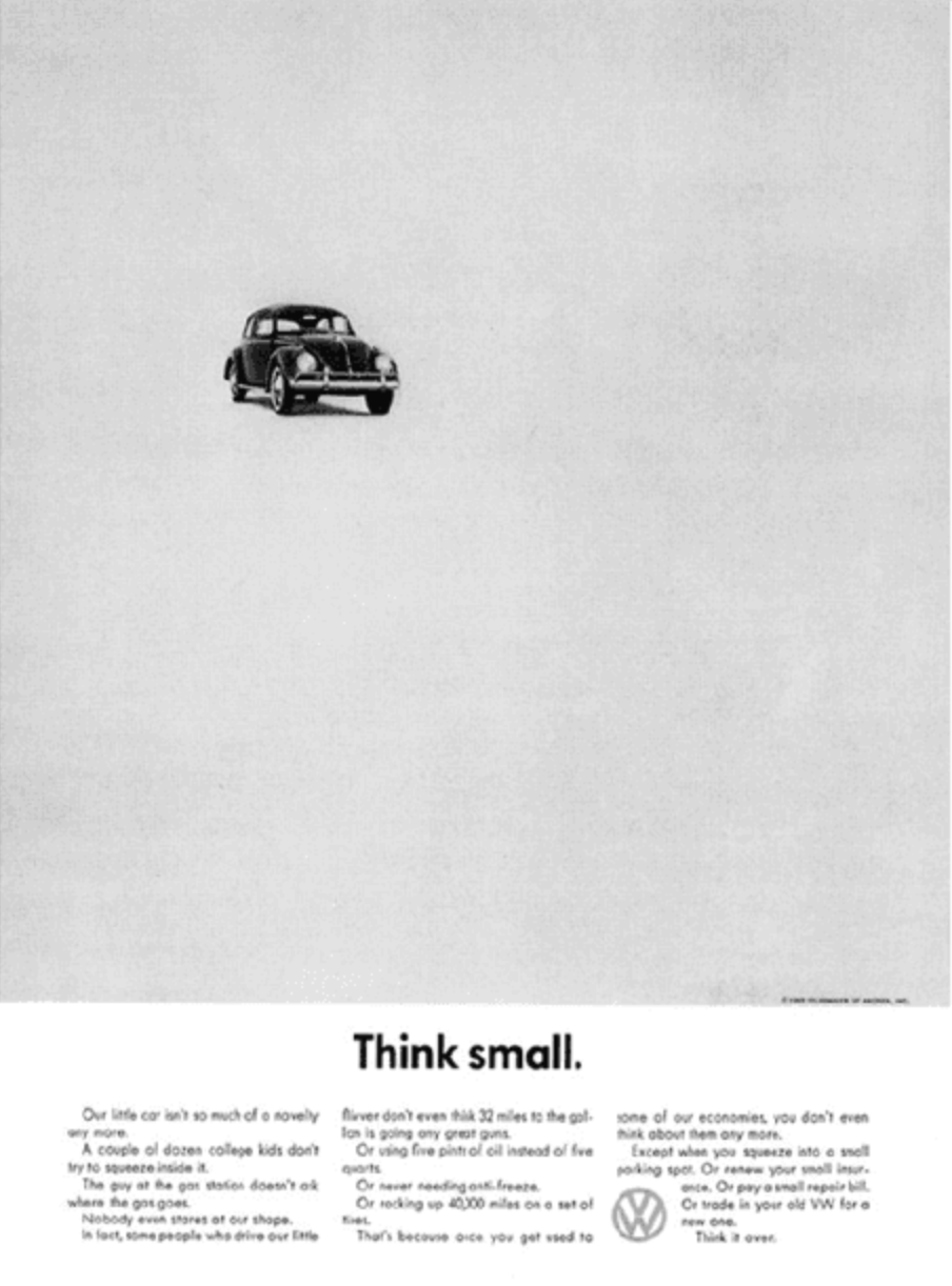
Visual Description: A black and white ad. The majority of the design is a blank, white space, with a distant Volkswagen Beetle in the upper and left thirds. A tagline below the image reads “Think small.” with additional ad copy below.
What Made It Work: In Volume 1 Part 2 of this series, we mentioned the Volkswagen “Think Small” campaign while profiling a different famous Volkswagen ad. This time around, we decided it was time to make room for the GOAT. This ad broke so many marketing rules - the product was hard to see, there was too much negative space, and above all the copy called attention to something that many considered a flaw. Subverting so many expectations all at once forced readers to think harder about the points being made, and ultimately concede that maybe their preconceived notions were wrong.
Marketing Takeaway for Today’s Brands: Print ads hold a viewer’s attention for longer. This makes them the far superior format for getting folks to do a double take with your design and copy. That double take disrupts the passive consumption state we’re so often in when we’re seeing ads, and forces the viewer to actually think about your message - and whether your product really is right for them.
Source: Speedcraft Volkswagon.
Avis - “We Try Harder”
Year: 1960’s
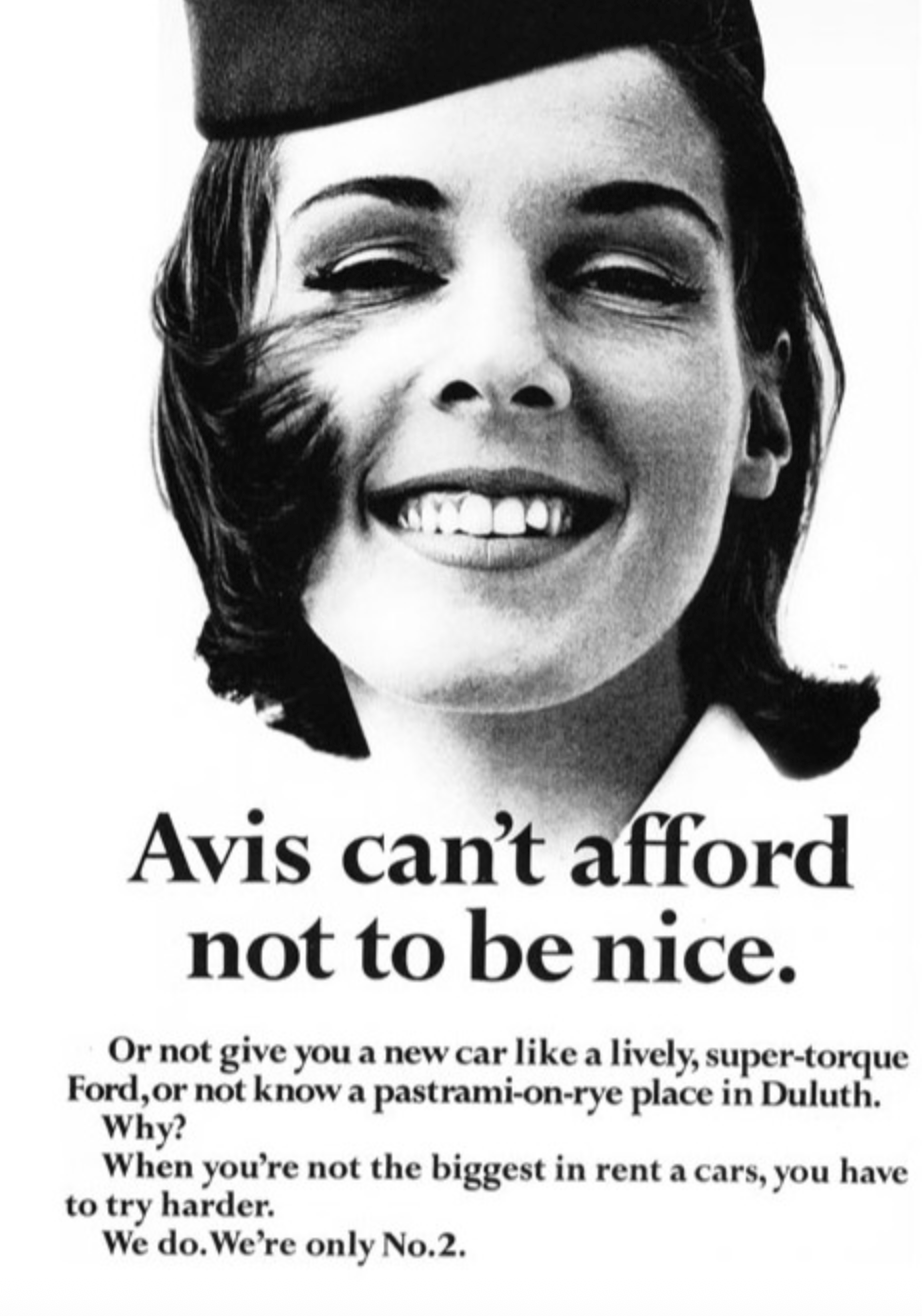
Visual Description: A black and white ad. The upper half of the design is a close-up photograph of the face of a smiling young woman wearing the avis uniform. Her bob hair cut is caught in a breeze and being blown across her right cheek. The tagline below her is black text on a white background. It reads “Avis can’t afford not to be nice.”
What Made It Work: Here’s another legendary example of subverting expectations with print ads. Designed to look almost like newspaper headlines, the “We Try Harder” ads laid claim to Avis’ second place standing in the rental car industry and, while confused viewers tried to figure out what was going on, deftly transitioned into explaining why that weakness actually made them stronger.
Marketing Takeaway for Today’s Brands: A bit of clever stylistic mimicry, + some tongue-in-cheek copywriting can turn a regular print ad into a point of conversation. The kind of ephemera folks still want to cut out of a magazine or show to a friend. Clever sells, in other words. Especially when it’s in print, where folks naturally linger longer on the content in front of them.
Source: Swiped.
Albany Life - “Are You Making Plans for your Wife’s Death?”
Year: 1983
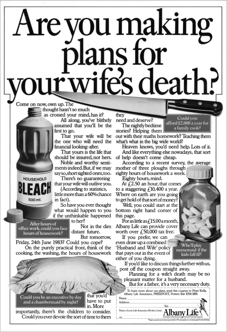
Visual Description: A black and white ad. The headline at the top is broken into three lines of black text on a white background and reads “Are you making plans for your wife’s death?”. Beneath the headline two columns of copy are laid out like an article. Interspersed are four images - a knife, a bottle of bleach, a pillow, and a bottle of pills. Each image has a grey text box beneath it with a caption explaining that these aren’t meant to imply murder, but instead to illustrate all the hard work a man’s wife does and how he wouldn’t want to be without a plan should she pass away. In the bottom right corner, a small box contains the Albany Life Insurance logo and a slip readers can cut out to send in for more information.
What Made It Work: There’s a lot of sexism in this ad. But if you can look past that, the shocking imagery combined with tongue-in-cheek copy is peak bait-and-switch advertising. Especially at the time of its release in 1983, this print ad delivered the perfect combination of off-color humor and sincere messaging.
Marketing Takeaway for Today’s Brands: We can’t necessarily recommend the exact line of comedy this ad took. However, its bait-and-switch approach combined with its mock article design, used to genuinely entertain before ultimately asking the reader to pause and think, is just as winning a formula today as it was four decades ago.
Source: Ancient & Modern.
The Economist - “I Never Read The Economist”
Year: 1989
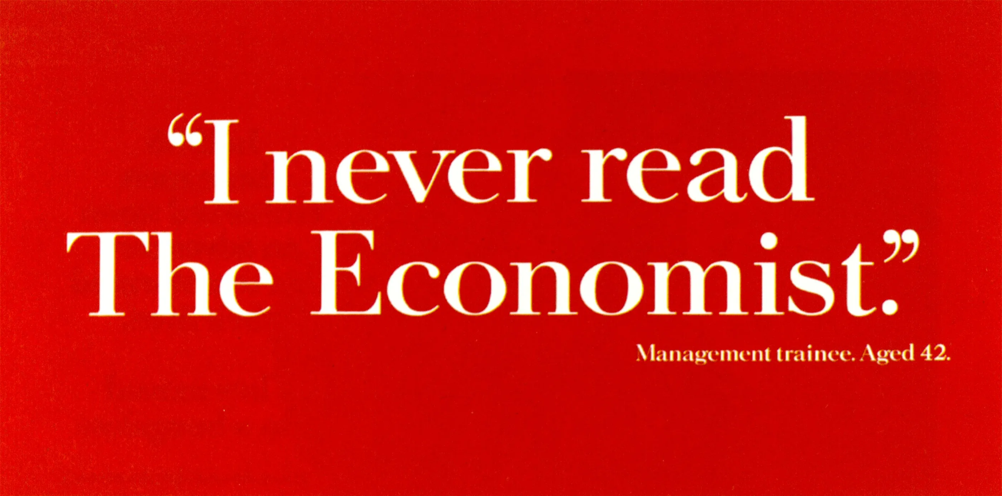
Visual Description: A rectangle filled in with The Economist’s signature red color. It contains three lines of white, serif text. A large quote states “I never read The Economist,” while tiny text below it ascribes the quote to a “Management trainee, Aged 42”.
What Made It Work: This ad subtly plucks at a reader’s ego and insecurities simultaneously, making an unforgettable impression in less than 60 characters. Its simple, bright composition is eye-catching. Its copy is just a touch confusing at first. And its punchline, delivered in tiny text, hits hard without ever saying anything directly.
Marketing Takeaway for Today’s Brands: Print ads don’t need to be obvious in their messaging. In fact, ads that take advantage of the heightened dwell time print enjoys by being just slightly obtuse often make a more lasting impression.
Source: D&Ad.
Xbox - FIFA 18
Year: 2018
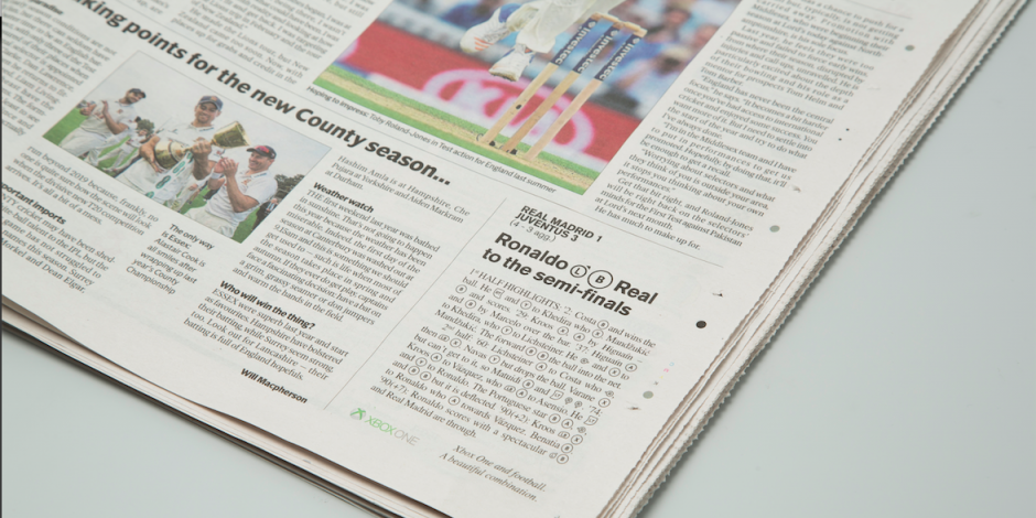
Visual Description: A short black and white newspaper article positioned in the bottom right corner of the paper. The headline talks about football player Cristiano Ronaldo getting his team, Real Madrid, into the semi-finals. But simplified images of two of the buttons from the XboxOne controller are used instead of normal verbs.
What Made It Work: Article mimicry is a great way to draw readers in with an expectation, then subvert it by doing something unexpected with the text. In this case, Xbox appeared to simply sponsor a small article reporting on the winning moment of the quarterfinal match. But they did so in a way that FIFA 18 players could put into practice, translating the real world event into a series of button presses that could be used in-game. It was a terrific example of committing to the bit, and showing how traditional print media are powerful tools for generating buzz about digital and tech products.
Marketing Takeaway for Today’s Brands: If you’re marketing for something that’s largely online, such as a multi-player focused AAA game, print ads may seem anachronistic at first. But it’s actually the contrast in formats that can make them so compelling. That contrast deftly subverts expectations, one of the fundamental principles behind most great ads.
Source: Famous Campaigns.
IKEA - Brighton Store Opening
Year: 2026
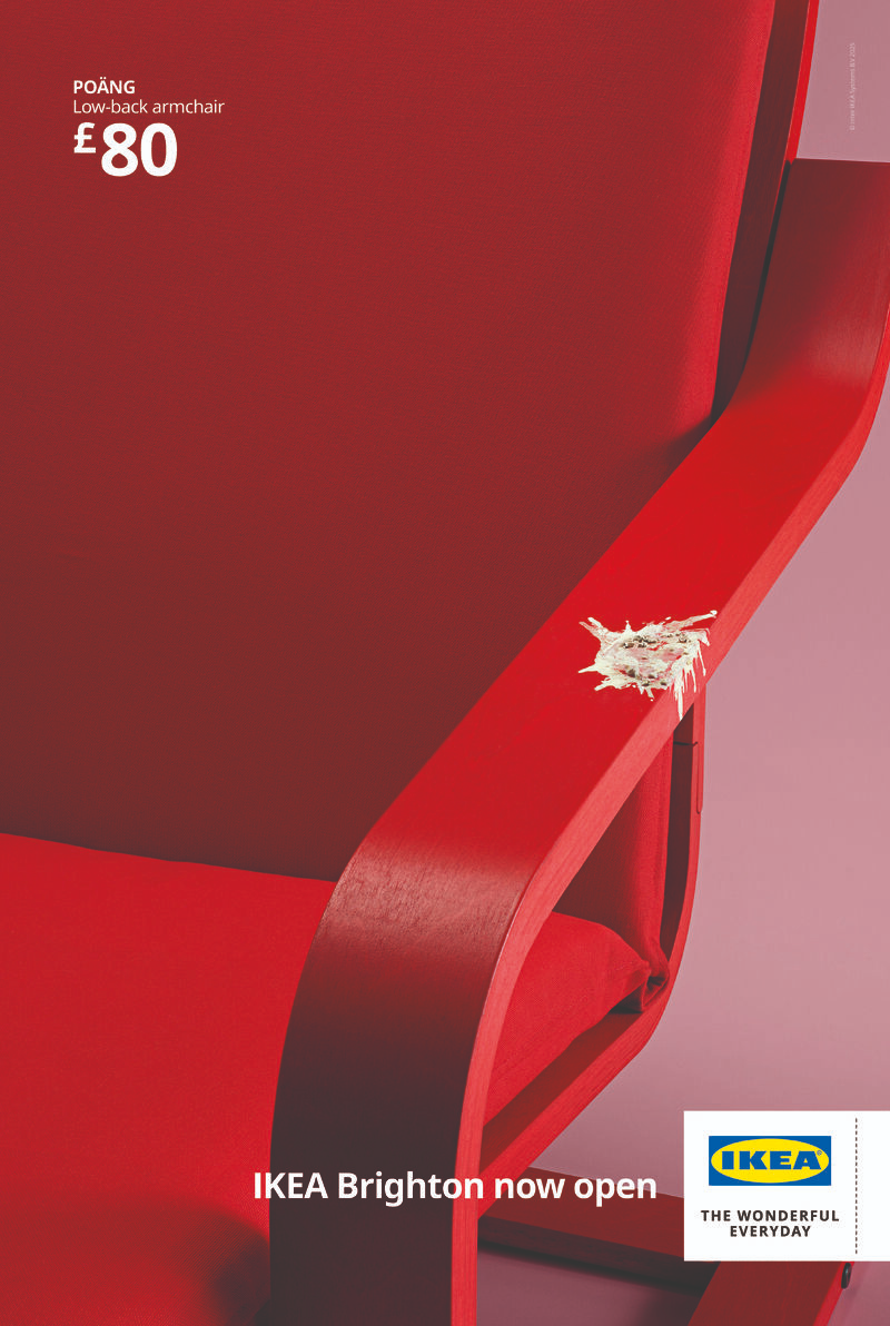
Visual Description: A poster featuring a close up view of the right side of a red IKEA POÄNG chair. The small white price and product name in the upper left hand corner mimic the look of a classic IKEA catalog. But centered on the arm of the chair is an unmistakable splatter of white seagull poop. At the bottom, the tagline reads “IKEA Brighton now open” beside a small white box containing the IKEA logo.
What Made It Work: Some brands seem like they just can’t miss with their ad ideas, and IKEA is one of them. These posters took a different form of print collateral IKEA had long done well, their late great print catalog, and riffed on it by subjecting a perfectly photographable chair to a familiar offense faced by Brighton residents. This s*** was funny, hyper relevant to locals, and very effective at driving new customers in to celebrate the store’s opening.
Marketing Takeaway for Today’s Brands: Print poster marketing remains one of the most effective ways to send a locally tailored message directly to a local audience. And with direct mail you can take things even further, personalizing the messaging right down to the individual so you can build stronger emotional connections with your target demographic.
Source: Famous Campaigns.
Series: The Best Print Ads of All Time (Vol 2)
Looking for the original series? [View Volume 1 →]
Conclusion
Work that stands out across time and industries
Looking for more insights on print marketing and design? Check out the latest blogs from Wallace Carlson for expert tips, industry trends, and strategies to elevate your brand.