The Best Print Ads of All Time (Part 2)
Part 2 of 4. Iconic print ads that defined eras, why they worked, and what modern marketers can learn from their design, messaging, and emotional impact.
.png)
Series: The Best Print Ads of All Time
- Part 1: [The Best Print Ads of All Time (Part 1)]
- Part 2: [The Best Print Ads of All Time (Part 2)]
- Part 3: [The Best Print Ads of All Time (Part 3)]
- Part 4: [The Best Print Ads of All Time (Part 4)]
Volkswagen - "They Said It Couldn't Be Done"
Year: 1966
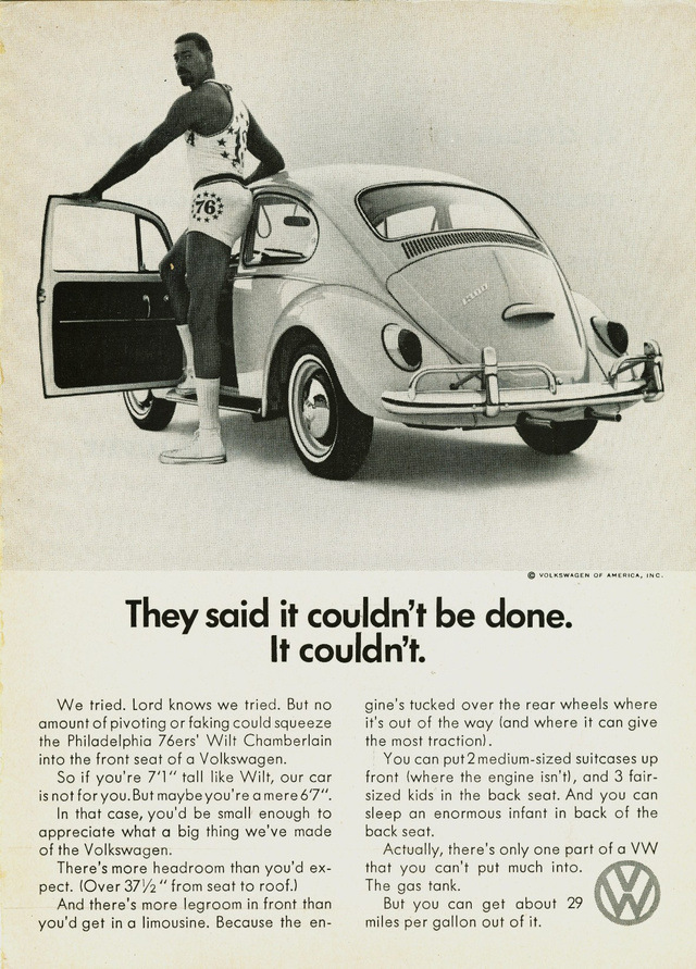
Visual Description: A black and white full-page ad with an image on top and two columns of text below. The image features basketball player Wilt Chamberlain posing beside a Volkswagen Beatle. The text starts with the headline “They said it couldn’t be done. It couldn’t.” It then tells the story of how they simply were not able to fit the 7’11” Wilt into the small car. However, they point out, there’s still plenty of room for anyone 6’7” or under.
What Made It Work: Volkswagen’s history is littered with award winning print ads, including their legendary “Think Small” campaign. We opted to highlight this one for its exceptional visuals. Even before reading the headline, the viewer’s brain is doing a double take thanks to the combo of a beloved celebrity athlete and an absurd scenario. Then the headline brings the point home, delivering humor and tongue-in-cheek reverse psychology in eight simple words.
Marketing Takeaway for Today’s Brands: Viewers expect to do a bit of reading with print advertising. That gives marketers the opportunity to tell a stronger story that entertains and engages their audience. Just make sure all copy is compellingly linked to the ad’s visuals to guarantee a cohesive experience. Booking an instantly recognizable celebrity doesn’t hurt either!
Source: https://www.playforthoughts.com/blog/the-best-print-ads
Creative Agency: Doyle Dane Bernbach (DDB)
U.S. Army - "I Want You For U.S. Army"
Year: 1917
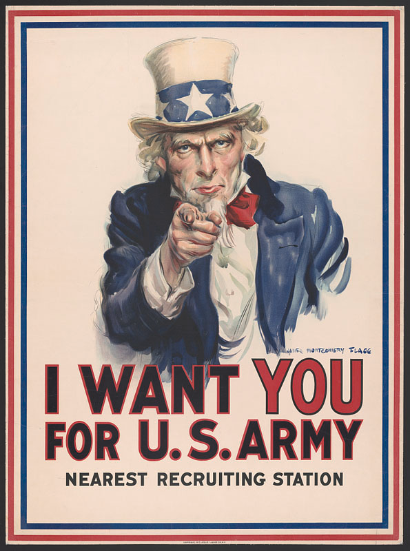
Visual Description: A portrait of the fictional character “Uncle Sam”, pointing directly at the viewer with a stern expression. Below him is the slogan “I Want You For U.S. Army - Nearest Recruiting Station” written in all caps.
What Made It Work: This iconic advertising poster is simple, confrontational, and personal. It speaks directly to the reader, using a well-known character making direct eye contact to compel action. Its text is unmistakably simple, and includes a clear action for the reader to take - head to that army recruiting station.
Marketing Takeaway for Today’s Brands: Many modern brands have leveraged this poster’s fame directly, parodying its iconic pose and slogan. But it offers more than just an opportunity to mimic a famous design. It also models how to leverage physical print’s ability to stop a viewer in their tracks. A face staring at you from a computer screen just doesn’t have the same presence or magnitude as a face on a poster, occupying the same physical space as you, daring you not to look away.
Source: https://teachingamericanhistory.org/document/recruitment-poster/
Artist: James Montgomery Flagg
LEGO - "The Shadow Knows"
Year: 2009
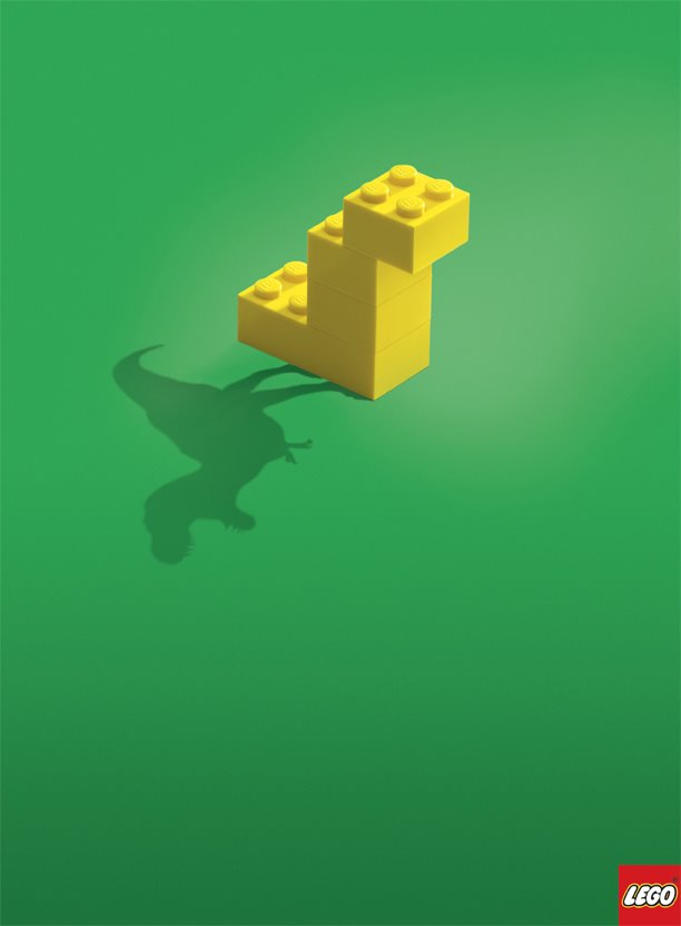
Visual Description: A LEGO model composed of four yellow bricks is centered in the upper third of the ad. A lightsource, out of shot to the right, casts a shadow to the bottom right of the model. However, instead of the literal shadow the model should be casting, we see the unexpected silhouette of a Tyrannosaurus rex.
What Made It Work: This is another ad that takes advantage of print’s slower consumption rate, presenting a visual that takes a few fractions of a second longer to fully digest. Once grasped, its creative subversion of expectations allows LEGO to communicate its point without a single word - that its product inspires imaginative play.
Marketing Takeaway for Today’s Brands: Print can help a brand feel more evolved, thoughtful, and principled. The restraint shown in this ad’s design works, in part, because print formats allows viewers more time for consideration and appreciation of a good idea.
Source: https://mymodernmet.com/creative-ads-lego-the-shadow/
Artist: Blattner Brunner
Coke - "Try Not to Hear This"
Year: 2019
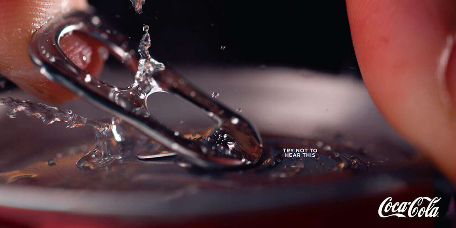
Visual Description: An extreme close up on the top of a can of Coke. The metal tab is being lifted up by a finger tip, while another finger tip is pressed down against the rim of the can. There’s a spray of water flinging off droplets beneath the lifted tab, and a few droplets of soda emerging from the perforated edges of the hole in the top of the can. The tagline “Try not to hear this” is written in fine print to the right of the tab.
What Made It Work: First, the image itself is compelling, depicting a frozen, familiar moment with an enticing level of detail and clarity. But what makes this ad particularly effective is the tiny tagline. It confidently forces the reader search for it, then uses a bit of reverse psychology to get them imagining the iconic, mouthwatering snap of a cold drink being opened.
Marketing Takeaway for Today’s Brands: One of the biggest drawbacks of print is that it can’t leverage sound - or can it? This ad proves that a print’s image fidelity, clever copy, and great design can evoke powerful sense memories like sound, smell, or taste so completely, they may as well be present. All it takes is considering what visuals best trigger those senses, and printing them in an eye-catching way.
Source: https://www.printpower.eu/case-studies/see-a-coke-hear-a-coke-want-a-coke/
Creative Agency: DAVID Miami
Faber-Castell - "Shot On Faber-Castell"
Year: 2025
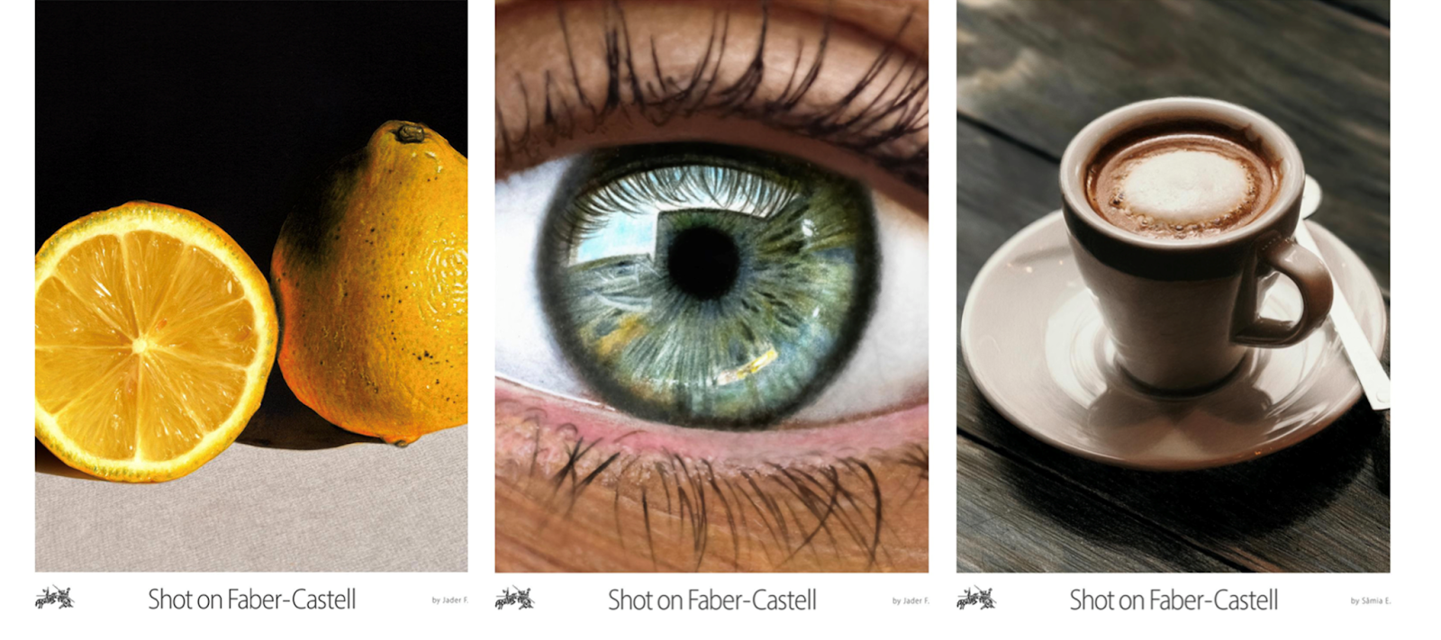
Visual Description: A series of posters featuring photo-realistic colored pencil drawings of lemons, a human eye, and a mug of coffee. All three posters feature the Faber-Castell logo on the bottom left on a white background, beside the centered tagline “Shot on Faber-Castell”.
What Made It Work: These posters give viewers a chance to see the exceptional results of a high-quality art product almost in-person. They emphasize the precise and technically demanding traditional techniques of colored pencil drawing, both through the artwork on display, and via the tongue-in-cheek tagline that calls back to the well-known “Shot on iPhone” slogan.
Marketing Takeaway for Today’s Brands: These posters are a testament to print advertising’s ability to create memorable moments for viewers by capitalizing on the unique benefits of the format - high quality printing, slower consumption speeds, and more engaged viewers. They’re also a reminder that some products just get the message across better with print. Colored pencils, as a traditional tool of fine art, are simply more likely to have customers who gravitate towards traditional mediums with high-quality, tactile finishes
Source: https://www.printpower.eu/insight/six-global-brands-that-prove-the-power-of-print-ads-in-cannes/
Creative Agency: DAVID São Paulo
Series: The Best Print Ads of All Time
- Part 1: [The Best Print Ads of All Time (Part 1)]
- Part 2: [The Best Print Ads of All Time (Part 2)]
- Part 3: [The Best Print Ads of All Time (Part 3)]
- Part 4: [The Best Print Ads of All Time (Part 4)]
Conclusion
Work that stands out across time and industries
Looking for more insights on print marketing and design? Check out the latest blogs from Wallace Carlson for expert tips, industry trends, and strategies to elevate your brand.