The Best Print Ads of All Time (Part 3)
Part 3 of 4. A deeper look at legendary print ads and the creative principles that still influence modern marketing campaigns.
.png)
Series: The Best Print Ads of All Time
- Part 1: [The Best Print Ads of All Time (Part 1)]
- Part 2: [The Best Print Ads of All Time (Part 2)]
- Part 3: [The Best Print Ads of All Time (Part 3)]
- Part 4: [The Best Print Ads of All Time (Part 4)]
Toyota - "2018 Toyota Camry"
Year: 2018
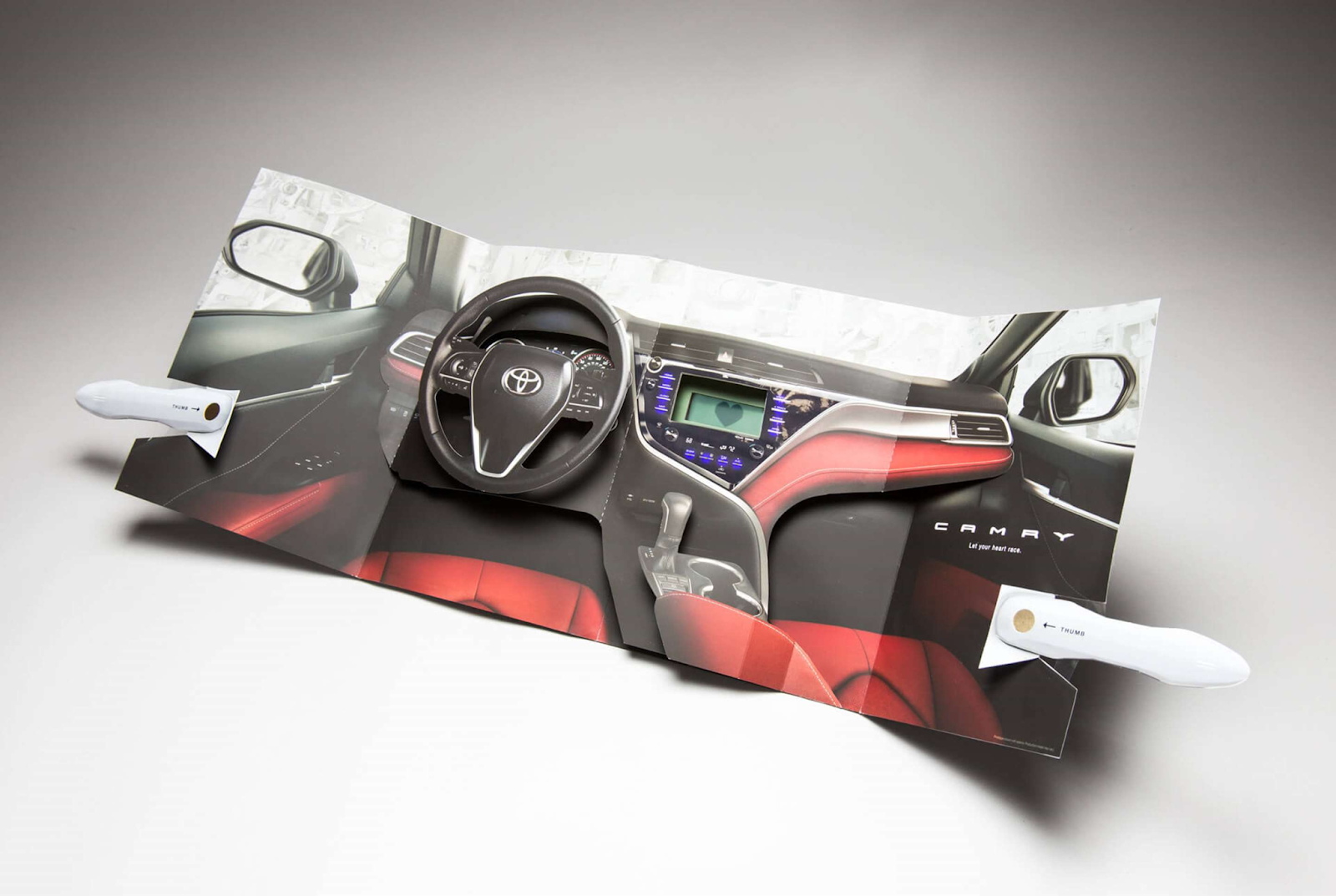
Visual Description: A gatefold advertisement with moving car door handles. The ad opens to reveal a pop-up version of the steering wheel and console of a 2018 Toyota Camry. The 3D effect creates an immersive feeling, as though the viewer were literally behind the wheel for a test drive.
What Made It Work: Print marketing’s tactility is one of its strongest attributes. Afterall, compelling research shows that once we touch something, we feel a stronger sense of ownership towards it. This ad capitalizes on that bit of human psychology by deftly recreating the experience of pulling on a camry’s door handle and sitting down behind the wheel.
Marketing Takeaway for Today’s Brands: Even if a 3D pop-up, fully articulated gatefold ad isn’t in your budget, you can still create print ads that replicate the sense of touching your product. Advanced textures and finishes, like soft touch or metallic foil, can help you bring your product to life on the page and encourage multi-sensory interactions that increase engagement and desirability.
Source: https://www.printpower.eu/case-studies/why-toyota-wants-you-to-get-a-grip/
Creative Team: Saatchi & Saatchi Dallas/Los Angeles
YPF, Lionel Messi, Adidas - "Soccer Ball Instruction Manual"
Year: 2024
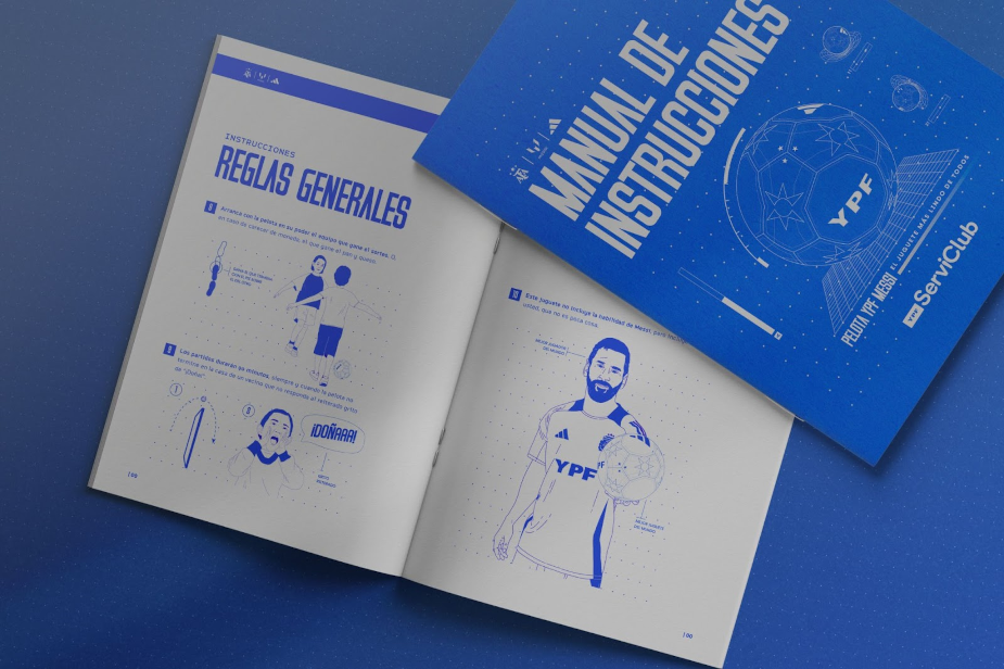
Visual Description: A booklet printed in blue and white, reminiscent of blueprints and classic instruction manuals. The cover reads “Manual of Instructions” in spanish. The pages are filled with tongue-in-cheek illustrations of how to use a soccer ball.
What Made It Work: YPF wanted to find ways to emphasize the luxury and prestige of their collaboration soccer balls with Adidas and superstar athlete Lionel Messi. So they developed an instruction manual, much like the ones that come with high end electronics or luxury watches. While definitely funny, it also sincerely elevates the desirability of the product by turning this bit of print advertising into a coveted piece of memorabilia in its own right.
Marketing Takeaway for Today’s Brands: Cleverly designed booklets give brands more real estate to tell a story, explore a theme, and entertain consumers in a memorable way. They motivate consumers to spend more time with your brand. And, if the content is entertaining or useful enough, booklets are likely to be held on to for an extended period of time, giving your brand a long-term physical presence in the recipient’s life.
Source: lbbonline.com/news/this-campaign-offers-up-a-manual-for-the-ypf-messi-adidas-balls
Creative Team: Mercado McCann
IKEA - "SÖMNIG"
Year: 2018
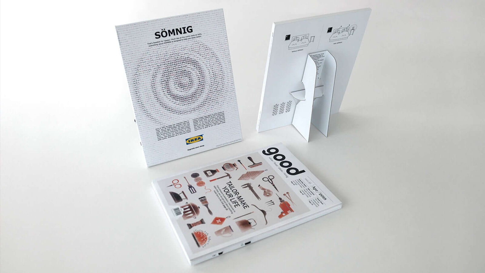
Visual Description: A flat-pack ad that assembled into a book-sized tabletop standee. The ad features a product name, SÖMNIG, printed along the top. When a tab on the back is pulled down to set the standee in place, it engages a hidden speaker inside that plays white noise and releases a soothing lavender scent. The ink was also infused with lavender aroma. The ad was attached to the back of the April 2018 edition of the magazine ‘good’.
What Made It Work: This ad was ridiculously over-engineered, in a way only IKEA could pull off. It took multi-sensory advertising to a wild new level, and provided an exceptional sense of value for potential customers looking for better sleep.
Marketing Takeaway for Today’s Brands: Fortunately, you don’t need to include a hidden speaker in your print ads to create a memorable experience. Fold out designs, scratch-off sections, and scannable QR codes are all accessible print treatments that help generate excitement, engagement, and perceived value and will build customer affinity.
Source: https://www.printpower.eu/case-studies/ikea-between-the-sheets/
Creative Team: Memac Ogilvy
KitKat - "Chunky Mail"
Year: 2012
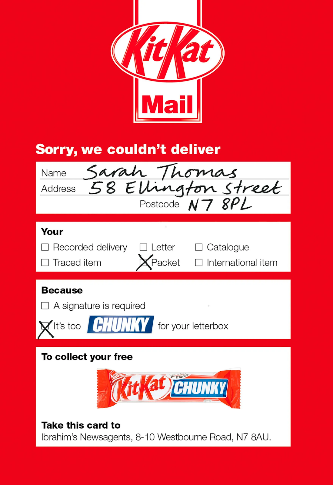
Visual Description: An imitation of a failed delivery slip in KitKat’s iconic red and white colors. Under the reason the item couldn’t be delivered, the box is checked for “It’s too CHUNKY for your letterbox”. The recipient is then directed to bring the ad to their local newsagent to collect their missed delivery - a KitKat CHUNKY candybar.
What Made It Work: Mimicking a stressful bit of mail - a missed delivery slip - was a bold move. But keeping the candy’s brand colors prominent ensured the recipient was never in doubt of what was actually going on. But the biggest success of this ad was its follow-through - thousands of recipients redeemed their slip as instructed, and received a free candybar as promised.
Marketing Takeaway for Today’s Brands: Taking a familiar, banal print product and spoofing it in a humorous way is a tried-and-true method for getting customers to look twice. And in today’s digital-skewed landscape, a physical ‘redeem this card’ tactic offers a renewed sense of deal-snagging novelty, particularly for a younger audience.
Source: https://www.dandad.org/work/d-ad-awards-archive/chunky-mail
Creative Team: JWT London
Heinz - "Heinz Ketchup Puzzle"
Year: 2020
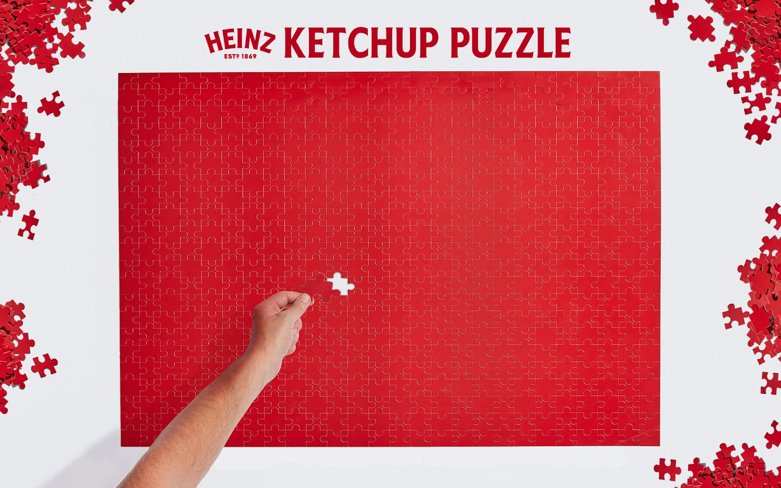
Visual Description: A puzzle printed entirely in solid, Heinz ketchup red. No logo, no additional text - just the red color that’s synonymous with the brand’s signature condiment.
What Made It Work: Some of it was timing - the puzzle was released during the first lockdown of the pandemic, when people were desperately in search of activities they could do at home. But the other half of its success was its novelty. Puzzles have been used for advertising before. But this one’s confident embrace of the extra-difficult solid color concept got folks feeling particularly fired up to take on the challenge - and fired up for their favorite iconic ketchup brand.
Marketing Takeaway for Today’s Brands: Never underestimate the power of a signature shade. Heinz ketchup’s brand color is largely what sold this puzzle, and offset printing is the best way to make a big impression with your precise brand colors, thanks to Pantone Matching System (PMS) inks.
Source: https://www.dandad.org/work/d-ad-awards-archive/heinz-ketchup-puzzle
Creative Team: Rethink
Series: The Best Print Ads of All Time
- Part 1: [The Best Print Ads of All Time (Part 1)]
- Part 2: [The Best Print Ads of All Time (Part 2)]
- Part 3: [The Best Print Ads of All Time (Part 3)]
- Part 4: [The Best Print Ads of All Time (Part 4)]
Conclusion
Work that stands out across time and industries
Looking for more insights on print marketing and design? Check out the latest blogs from Wallace Carlson for expert tips, industry trends, and strategies to elevate your brand.