The Best Print Ads of All Time (Part 1)
The most iconic print ads ever made, why they worked, and what modern marketers can learn from their design, messaging, and emotional impact.
.png)
Series: The Best Print Ads of All Time
- Part 1: [The Best Print Ads of All Time (Part 1)]
- Part 2: [The Best Print Ads of All Time (Part 2)]
- Part 3: [The Best Print Ads of All Time (Part 3)]
- Part 4: [The Best Print Ads of All Time (Part 4)]
Apple – “Think Different"
Year: 1997
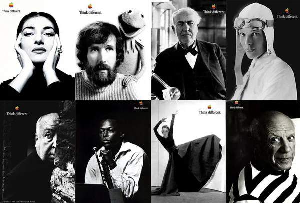
Visual Description: Striking black-and-white print ads featuring iconic figures such as Albert Einstein, Amelia Earhart, Gandhi, and John Lennon. Each portrait is paired with the Apple logo and the tagline “Think Different” in minimalist type. The absence of product images emphasizes the brand’s alignment with creativity and nonconformity rather than hardware specs.
What Made It Work: This campaign successfully positioned Apple as the brand for innovators and rebels by celebrating historical figures who changed the world. It broke away from typical tech marketing by focusing on emotional storytelling and values, not features or specs. The messaging was reinforced across multiple high-visibility print channels, including newspaper ads, posters, and billboards; and closely mirrored the tone and visuals of the “Here’s to the Crazy Ones” television commercial, creating a unified and memorable campaign.
Marketing Takeaway for Today’s Brands: A brand can transcend its product by aligning with deeper cultural values and timeless human aspirations. Apple’s seamless integration of print and broadcast media in the Think Different campaign illustrates how consistency across channels strengthens brand identity and inspires long-term loyalty. Matching the emotional core of the TV spot with print executions made the message stick, and set a new standard for modern brand storytelling.
Source: Posterama. “A Quick Guide to Apple’s Think Different Campaign.”
WWF (World Wildlife Foundation) - "Give a Hand to Wildlife"
Year: 2008
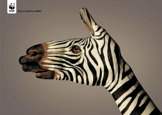
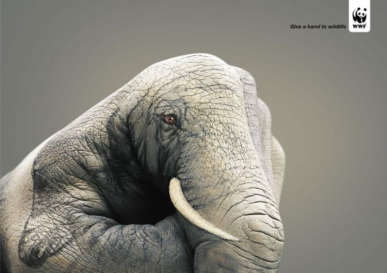
Visual Description: A series of striking images featuring human hands intricately painted to resemble endangered animals such as elephants, zebras, frogs, and eagles. The hand is posed to mimic the shape and texture of the animal, evoking anatomical detail via optical illusion. Each composition uses a minimal, dark background to make the painted hand, and the animal the emotional focal point.
What Made It Work: Created by Saatchi & Saatchi Simko in Geneva, this campaign used striking visual metaphors to blur the line between humans and nature. Each painted hand mimicked an endangered animal with uncanny realism, symbolizing how human hands have the power to protect or endanger wildlife. The campaign ran in posters and magazines and earned a Cannes Grand Prix for its emotional impact and artistic execution.
Marketing Takeaway for Today’s Brands: Print can still provoke, educate, and inspire when visual storytelling aligns with a clear message and purpose. A minimalist, emotionally resonant concept often leaves a stronger impression than cluttered designs or promotional copy.
Source: Filestage - 25 Best Print Ads of All TimeCreative Team: Saatchi & Saatchi Simko Geneva
Adidas - "Forever Sport"
Year: 2003
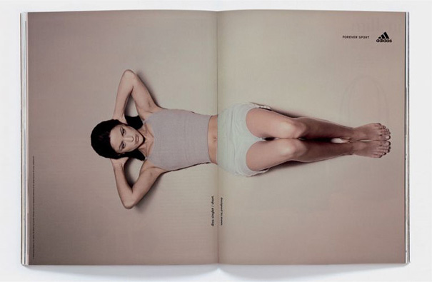
Visual Description: A woman dressed in Adidas sportswear. She’s laying on her back, both arms behind her head, legs bent and feet flat on the floor. Her abs are engaged, as though she’s about to perform an abdominal crunch exercise. The fold is positioned directly across her midsection, so that when the page is flipped, it mimics the movement of a crunch.
What Made It Work: One of the best aspects of print marketing is the tactile opportunity it presents. When you engage with the format, materials, print techniques, etc. in a creative way, you encourage viewers to linger a little longer and engage more thoughtfully. In this case, the few extra page turns the ad elicits from readers, charmed by the novel use of the magazine fold, equals considerably more time spent thinking about Adidas and its innovative approach to both advertising AND sportswear.
Marketing Takeaway for Today’s Brands: In a digital saturated era, a print ad campaign that gives customers a creative, tangible experience is even more powerful than it was back in 2003. Encouraging viewers to play with your prints will help your brand earn an enduring association with fun and ingenuity.
Source: https://magnetic.media/great-work/ads/adidas-forever-sport
Creative Team: TBWA Hong Kong
Burger King - "Meat?"
Year: 2022
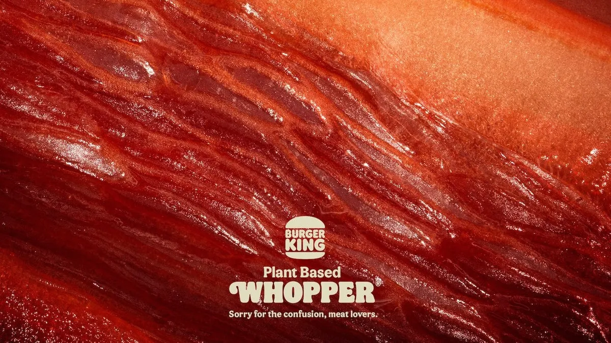
Visual Description: An extreme closeup shot of an unidentified, highly-textured, reddish-brown organic material. It looks similar to bacon. However, a tagline in small print at the bottom of the ad reads “Plant Based Whopper - Sorry for the confusion, meat lovers.”, implying the photographed material is actually some sort of fruit or vegetable.
What Made It Work: This ad takes advantage of two of print’s best features - its exceptional fidelity and its slower pace of consumption. A viewer flipping through pages or strolling past posters has just enough time to register the image as intriguing. Then, the small scale of the logo and tagline forces them to pause longer, looking for the twist. Finally, the realization that the bacon-y image is not bacon at all naturally leads one to reflect a moment on how they were initially bamboozled - and grow curious about whether this ‘plant based whopper’ is as good at fooling their tastebuds as the ad was at fooling their eyes.
Marketing Takeaway for Today’s Brands: Digital often demands simple, obvious ads that can be fully digested in just a few fractions of a second as customers scroll by. But with print, the rate of consumption is just a bit slower. This gives you an opportunity to draw attention with more nuanced thought provoking visuals. By embracing Images that are a bit confusing, even offputting, you can provoke curiosity then reward with satisfaction, revealing the hidden meaning with subtle, minimalist taglines.
Source: https://www.davidtheagency.com/works/en/meat-2
Creative Team: DAVID Madrid
La Ligue Nationale Alzheimer - "Alhzeimer's Day"
Year: 2010
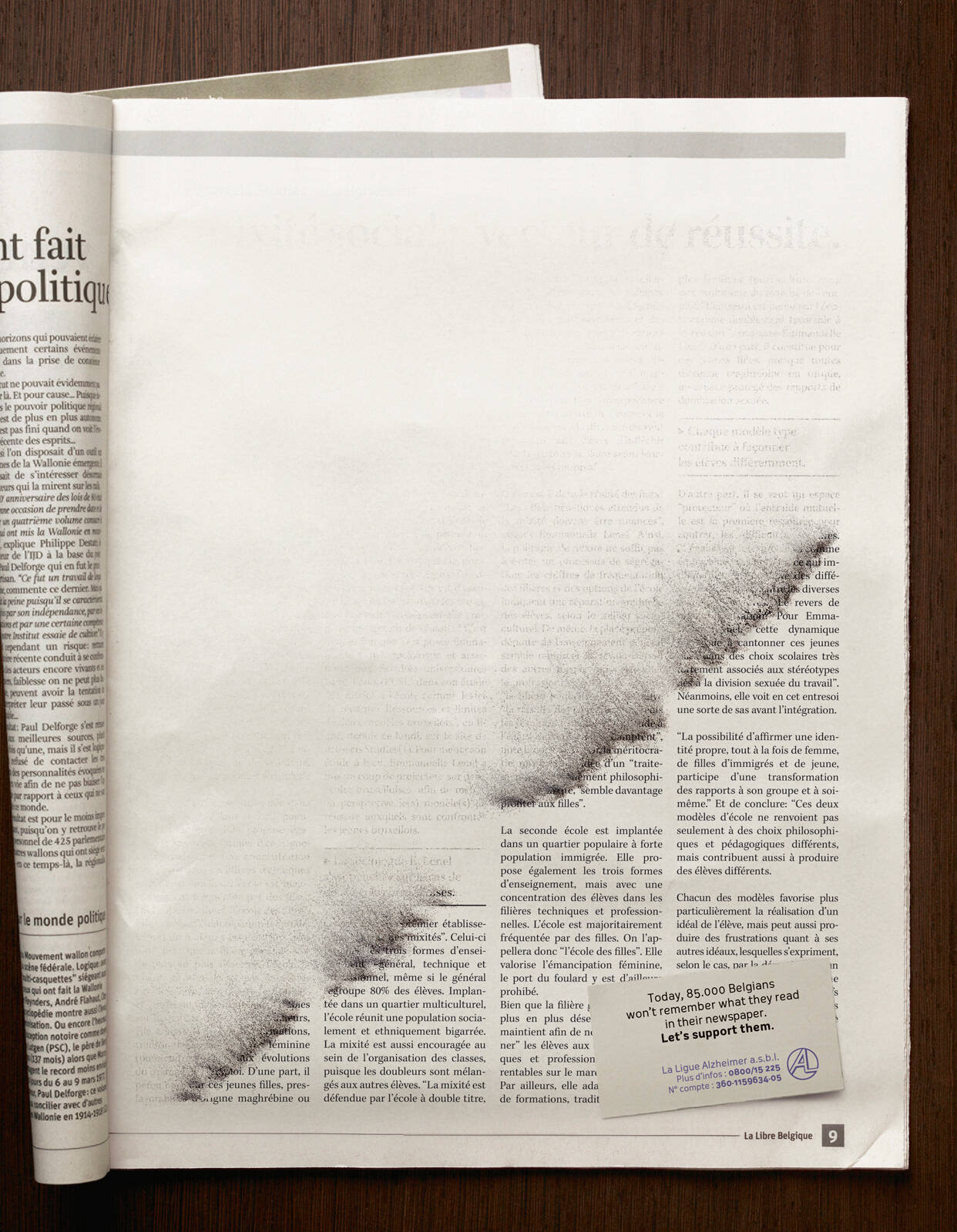
Visual Description: A full page article with four columns of text printed in black ink on white paper. However, the text appears to be in the middle of turning to dust and blowing away. A business-card resting atop the article in the bottom right corner reads “Today, 85,000 Belgians won’t remember what they read in their newspaper. Let’s support them.” Below that is the contact information for the Belgian National Alzheimers League.
What Made It Work: This print ad could work anywhere, but it’s especially effective in a magazine or newsletter where it can take advantage of the format to subvert expectations. It catches a reader’s attention, forces them to pause and consider what’s ‘gone wrong’ with this particular page, then gives a satisfying and meaningful ‘ah ha’ moment with its discrete tagline and CTA.
Marketing Takeaway for Today’s Brands: Print ad formats like magazines, newspapers, posters, and flyers are tangible media. That tangibility gives advertisers opportunities to play with optical illusions that encourage customers to pick up, poke at, brush off, or otherwise interact with the page in a way that is surprising and, most importantly, memorable.
Source: https://www.adsoftheworld.com/campaigns/alhzeimer-s-day
Creative Team: Publicis Groupe Belgium
Series: The Best Print Ads of All Time
- Part 1: [The Best Print Ads of All Time (Part 1)]
- Part 2: [The Best Print Ads of All Time (Part 2)]
- Part 3: [The Best Print Ads of All Time (Part 3)]
- Part 4: [The Best Print Ads of All Time (Part 4)]
Conclusion
Work that stands out across time and industries
Looking for more insights on print marketing and design? Check out the latest blogs from Wallace Carlson for expert tips, industry trends, and strategies to elevate your brand.