
The Best Print Ads of All Time (Part 4)
Part 4 of 4. The final collection of timeless print ads, examining what made them memorable and how their creative approach still inspires marketers today.
.png)
Series: The Best Print Ads of All Time
- Part 1: [The Best Print Ads of All Time (Part 1)]
- Part 2: [The Best Print Ads of All Time (Part 2)]
- Part 3: [The Best Print Ads of All Time (Part 3)]
- Part 4: [The Best Print Ads of All Time (Part 4)]
LEGO - "What it is is beautiful"
Year: 1981
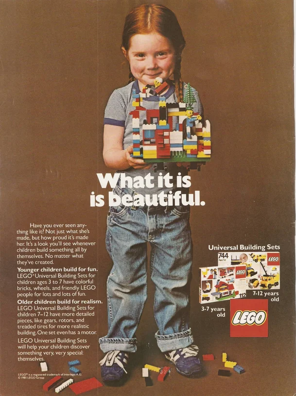
Visual Description: A young girl stands before a brown backdrop, smiling while holding up a colorful, indecipherable creation made entirely of LEGO bricks. In front of her in white is the tagline “What it is is beautiful.”.
What Made It Work: Despite the awkward “is is” copy used in the tagline, this has become one of the most iconic print ads in the history of toys. The composition is simple. The subject is infinitely charismatic. And the product is shown off not in its ideal state, but realistically used by the little girl to create something chaotic, messy, and lovable.
Marketing Takeaway for Today’s Brands: Simplicity and honesty can serve print ads particularly well, as the physical interaction between customer and paper naturally lends itself to more intimate moments. This ad is unlikely to stand out on the side bar of a webpage. But it’s downright arresting when encountered in real life.
Source: https://www.playforthoughts.com/blog/the-best-print-ads
KFC - "FCK"
Year: 2018
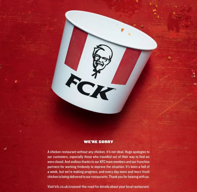
Visual Description: An empty KFC chicken bucket lays on its side on a dirty red surface. The letters on the bucket have been rearranged to read FCK. The white ad copy below starts off simply with the words “We’re sorry”, and continues with a heartfelt apology for a fried chicken shortage that forced their restaurants to unexpectedly close during the previous week.
What Made It Work: This was a full page newspaper ad, released as damage control following a somewhat disastrous week for KFCs in the UK. The eye catching re-mix of the brand’s initials were a big part of what made this print ad so memorable. However, it's also held up as the model for turning a sincere apology into additional brand-building momentum.
Marketing Takeaway for Today’s Brands: If your brand is ever in the unfortunate position of having to apologize for something to its consumer base as a whole, print can help the message feel more sincere and personal. Whether tongue-in-cheek like KFC or simple and earnest, there’s just something more meaningful about a mea culpa you can hold in your hands, as opposed to a fleeting flash of pixels on a screen.
Creative Team: Mother London
Stabilo - "Highlight the Remarkable"
Year: 2018
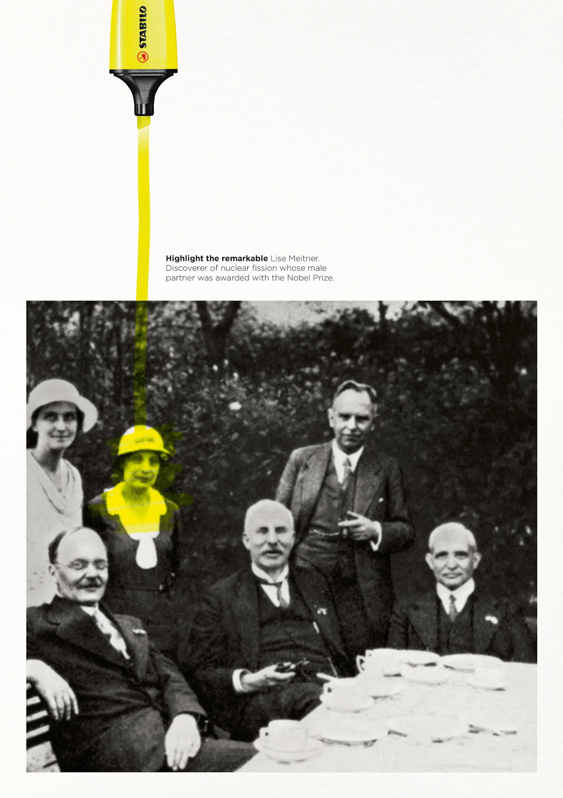
Visual Description: A black and white historic photograph is positioned at the bottom of the page. It features four men in the foreground and two women in the background. One of the women has her face highlighted in yellow. The yellow highlighter line continues off the top of the photo, ending at the tip of a stabilo highlighter that disappears off the top of the page. The copy explains the woman is Lise Meitner, discoverer of nuclear fission, whose work was credited to her male partner at the time.
What Made It Work: It takes a mundane task most people have done before - highlighting - and makes it intriguing with a simple, compelling story of an underappreciated figure who deserves recognition. On the one hand, it’s just showing their product in action. But in doing so, it also invites viewers to pause and process the untold story the brand has ‘highlighted’ for them.
Marketing Takeaway for Today’s Brands: Ads with optical illusions and mimicry of physical actions catch a viewer’s attention. This is doubly true when those ads are in print. With clever design and the right finishes, you can make a reader feel like they’ve just finished highlighting this photo themselves, ensuring this woman’s story is one they won’t forget.
Source: https://www.dandad.org/work/d-ad-awards-archive/highlight-the-remarkable
Creative Team: DDB Group Germany
Chupa Chups - "Sugarfree"
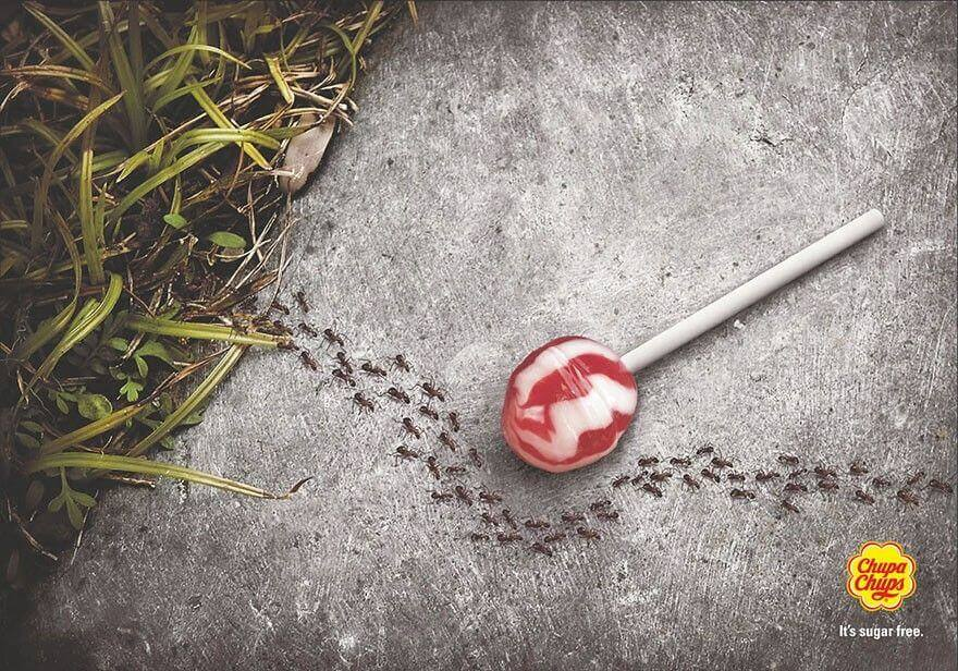
Visual Description: A red and white Chupa Chups lollypop lies on the pavement beside a stretch of grass and weeds. A line of ants marches out from the grass and across the pavement. However, instead of swarming the candy, their line bends to avoid it. In fine print below a small Chupa Chups logo, the tagline reads “It’s sugar free.”
What Made It Work: This ad presents a detailed, hyperrealistic image of something strange afoot. Then, it requires the viewer to scan the page for a moment to find the tagline that explains the twist. It’s a simple, effective strategy to engage the viewer’s brain and persuade them to hunt for the logo, building a much stronger memory of the brand in the process.
Marketing Takeaway for Today’s Brands: Viewers move just a little bit slower with print ads, providing brands more opportunity to catch their attention and entice them to engage with their image and message meaningfully. A bit of search-and-find, a visual pun, even a literal puzzle on the page - all these techniques are effective ways to use the slower consumption rate of print advertising to build stronger engagement with viewers.
Source: https://www.manypixels.co/blog/print-design/best-print-ads
Creative Team: DBB
WWF - "Lungs"
Year: 2008
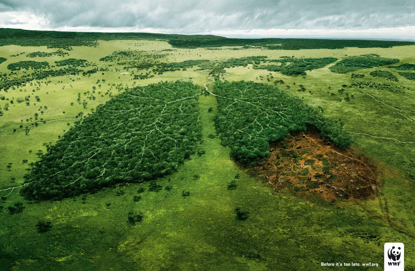
Visual Description: An aerial shot of a lush, wild green landscape, centered on two wooded areas that are shaped like lungs. However, the trees of the bottom right lung have been burned or cut away, leaving behind an ugly, muddy scar with tire tracks trailing off the page. In small print on the bottom right corner, the tagline reads “Before it’s too late.” beside the WWF logo.
What Made It Work: The image is initially beautiful, reminiscent of the kind of photography you see in National Geographic. But the uncanny shape of the lungs and the ugly damage done to them on the right immediately draws your attention. It’s an unnerving image, a flawless visual metaphor, and an effective ad for getting readers to pause and consider the point being made.
Marketing Takeaway for Today’s Brands: Whether you’re striving for something beautiful, unnerving, or a precision balance of the two, take advantage of the quality of modern print advertising. Saturated, detailed, captivating imagery jumps off the page and encourages viewers to stare at your ad for a little bit longer. Just make sure to follow your printer’s guidelines on resolution to ensure the end result is crisp and clear.
Source: https://www.digitaltripathi.com/ad-library/lungs-before-its-too-late-a-wwf-campaign/
Creative Team: TBWA Paris
Series: The Best Print Ads of All Time
- Part 1: [The Best Print Ads of All Time (Part 1)]
- Part 2: [The Best Print Ads of All Time (Part 2)]
- Part 3: [The Best Print Ads of All Time (Part 3)]
- Part 4: [The Best Print Ads of All Time (Part 4)]
Conclusion
Work that stands out across time and industries
Looking for more insights on print marketing and design? Check out the latest blogs from Wallace Carlson for expert tips, industry trends, and strategies to elevate your brand.


