The Best Print Ads of All Time: Vol. 2 | Part 1
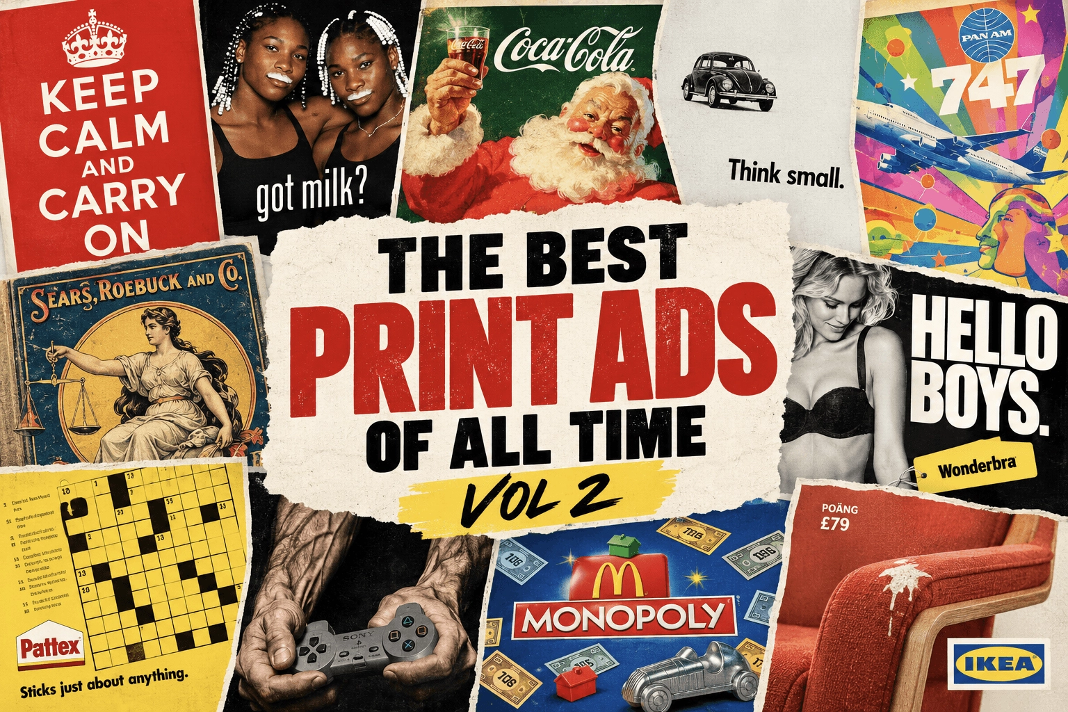
Iconic print ads from Keep Calm and Carry On, Got Milk? and more, with a look at the creative ideas that made these campaigns so memorable.
Series: The Best Print Ads of All Time (Vol 2)
Looking for the original series? [View Volume 1 →]
UK Government - “Keep Calm and Carry On”
Year: 1939
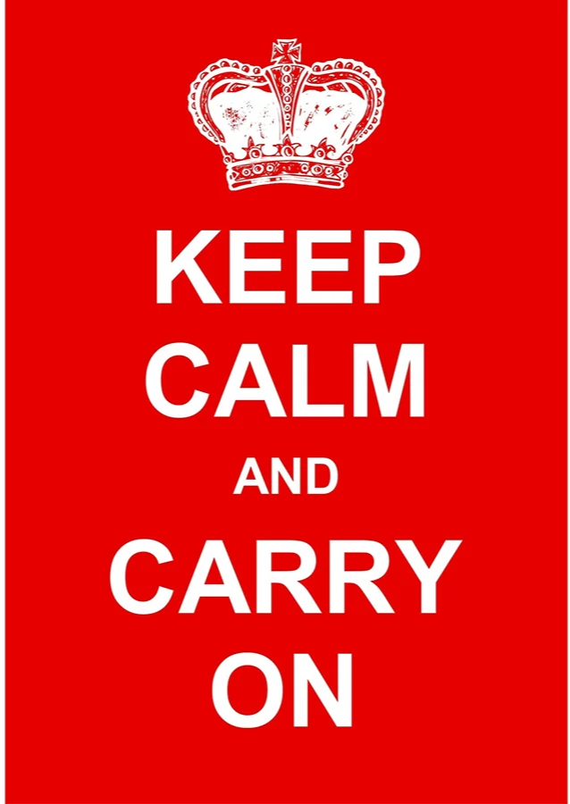
Visual Description: A bright red poster with white, sans serif text reading “KEEP CALM AND CARRY ON” in all caps, one word per line. The text is stacked in the center of the design. A white image of the Tudor crown sits directly above the text.
What Made It Work: This poster first showed up on British street corners during WWII, but it has endured as a pop culture icon to this day. And while its association with one of the most pivotal events of the 20th century is a big part of why it’s lived so long, it’s not the only reason. After all, there are plenty of propaganda posters that did not ‘carry on’, so to speak. This poster’s vibrant simplicity was a bold rejection of the heavily illustrated aesthetic of traditional wartime propaganda (see Uncle Sam from Volume 1, Part 2). This made its design feel fresh, modern, and lively. All emotions worth fostering when times are hard.
Marketing Takeaway for Today’s Brands: Print ad design has the biggest impact when it’s innovative and artistic. These are tangible items, taking up tangible space, and investing in a top quality look and feel elevates them from simple promotions to something people want to hang on to, even admire.
Source: University of London.
California Milk Processor Board - “Got Milk?”
Year: 1993-2014
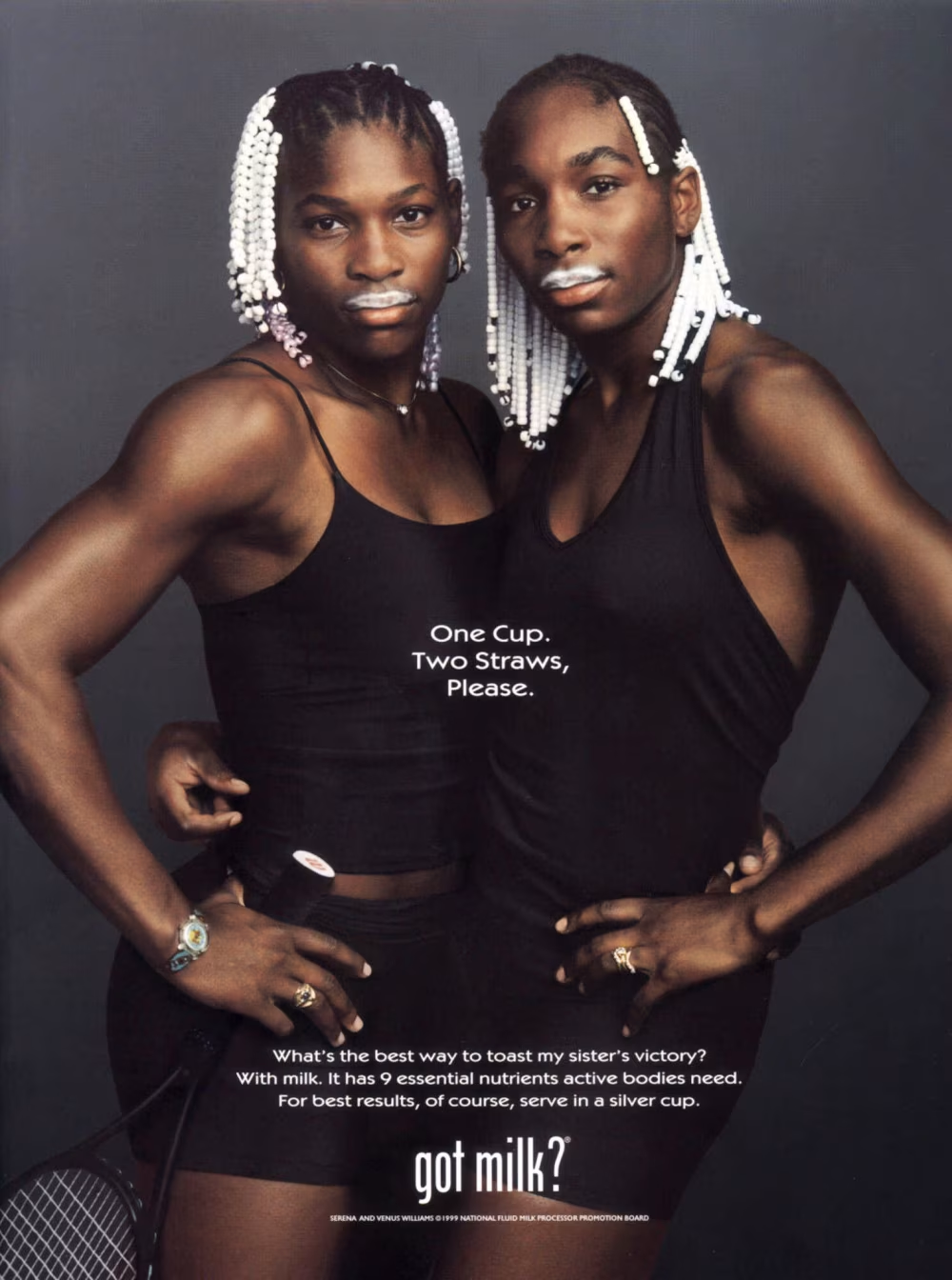
Visual Description: Tennis superstar sisters Venus and Serena Williams stand in front of a black backdrop, each with an arm around the other. They’re wearing black athletic clothing, with white beads in their braided hair and bright white milk mustaches. Three lines of white, sans serif text are centered over the two women, reading “One Cup, Two Straws, Please.” Additional ad copy is at the bottom of the image, anchored by the campaign slogan “got milk?” in a larger font size.
What Made It Work: While this example is from 1999, the ‘Got Milk?’ concept was repeated numerous times between 1993 and 2014. Much has been said about this legendary campaign, but at its core the formula was simple. Start with a famous face, add a milk moustache, take a great photo, repeat. The celebrity appeal and image quality turned these posters into collectibles in their own right, ultimately adorning countless bedrooms, offices, classrooms, and more.
Marketing Takeaway for Today’s Brands: When you’re designing print ads, aim for a design that’s so attractive, someone might just want to hang it up in their room. Compelling subject matter. An intriguing slogan in an eye-catching font. Subtle copy placement that doesn’t detract from the core imagery - get these principles right, and your print ads may end up so appealing, they practically distribute themselves.
Source: NBC News
MBF - Breast Cancer Screening
Year: 1993
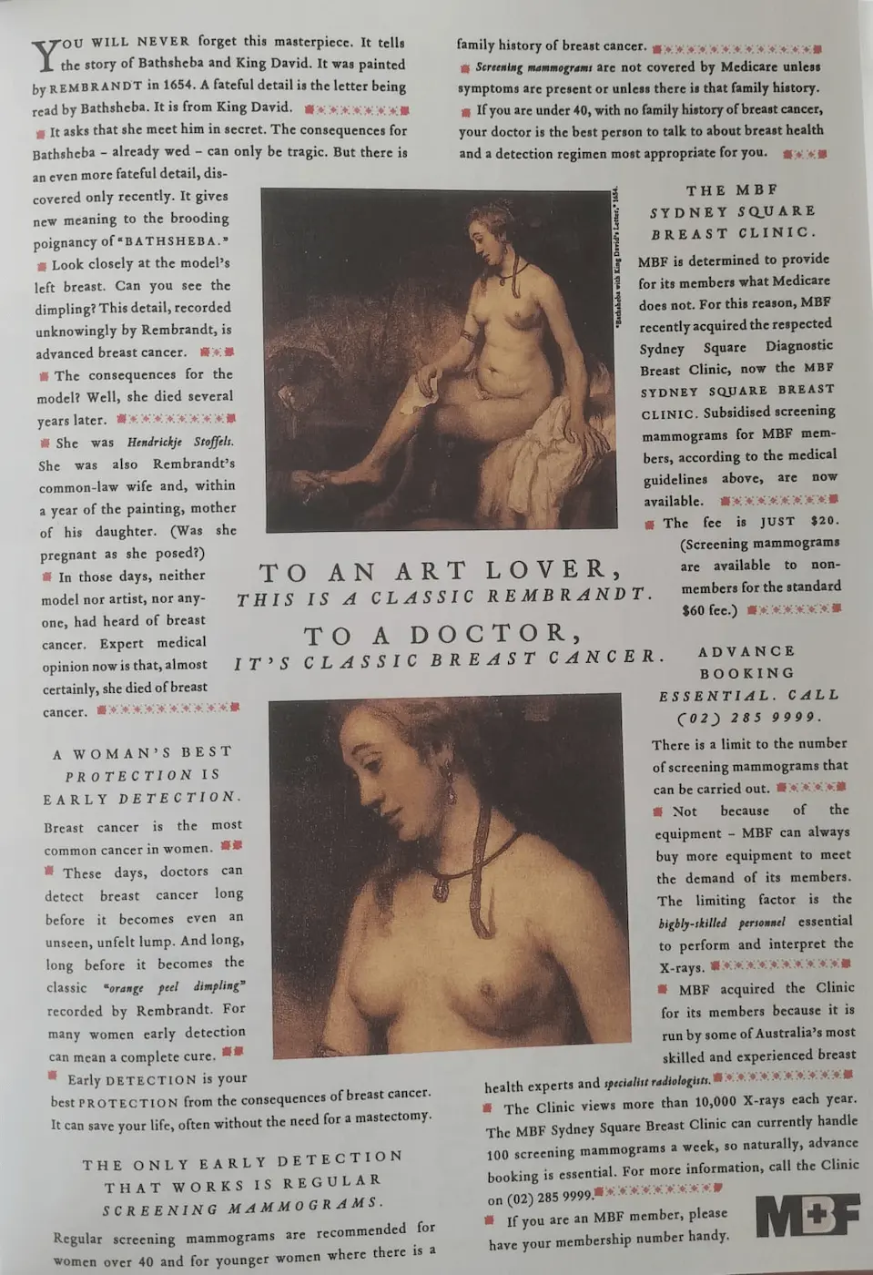
Visual Description: A full page magazine ad laid out like an article. Two columns of black and white text flank two images. The top image is of a nude woman from a Rembrandt painting. The bottom image is a close up view of her torso, illustrating the dimple of her left breast. The central copy between the two images reads: “To an art lover, this is a classic Rembrandt. To a doctor, it’s classic breast cancer”.
What Made It Work: Stylizing this ad like a conventional magazine article served two purposes. First, it allowed MBF to include all of the necessary information to convey their complex point about breast cancer screenings. And second, it turned what could have been an off-putting subject into an intriguing one. It hooked the viewer with a beautiful, sensuous bit of Renaissance art, then drew their eye down to the impactful headline. In the end readers, especially women, were compelled to pause and consider how this life threatening disease can hide in plain sight.
Marketing Takeaway for Today’s Brands: On average, consumers engage longer with print ads than they do with digital ones. And those extra seconds make print a superpowered medium for conveying complex messages about challenging subjects.
Source: Taschen, D&Ad "The Copy Book".
Help - “I Want to Save a Life”
Year: 2012
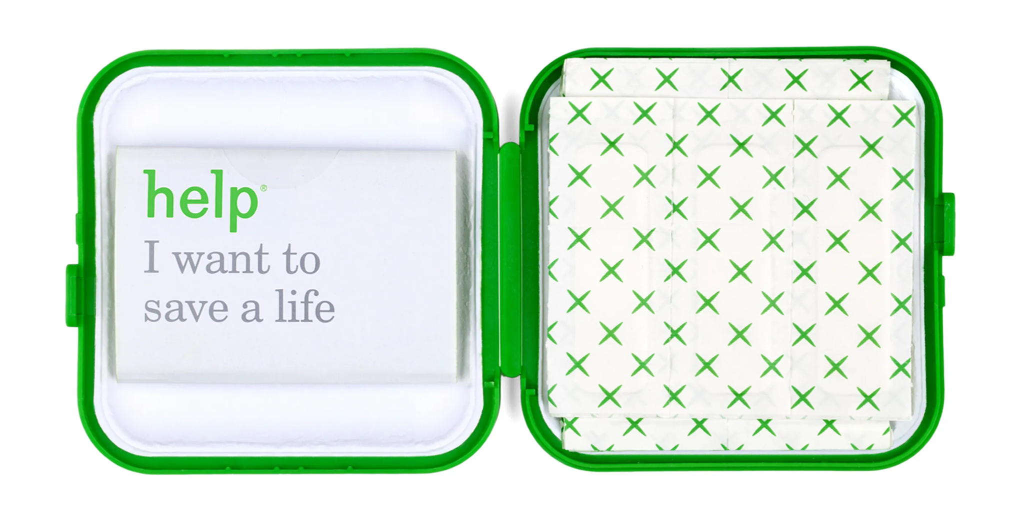
Visual Description: A small, green, hinged box lies open. A stack of individually wrapped adhesive bandages sits in the right compartment. In the left compartment, a folded piece of paper features the brandname “help” in green with grey text below it that reads “I want to save a life”.
What Made It Work: Inserts are among the most powerful forms of print advertising. They allow brands to reach an audience that’s already in a more receptive state. This particular insert was added to boxes of ‘help’ brand bandage. It was asking people to sign up for the bone marrow donor registry, and included everything necessary to complete that process. The final results were dramatic - a 1900% increase in bandages sold, and a three-fold YOY increase in donor registrations.
Marketing Takeaway for Today’s Brands: Partnering with the right brand, either to add print inserts to their products or to recruit their print inserts for yours, can be a powerful way to build credibility and positive associations.
Source: D&Ad.
Kobe Shimbun - “Emergency Collectibles”
Year: 2017
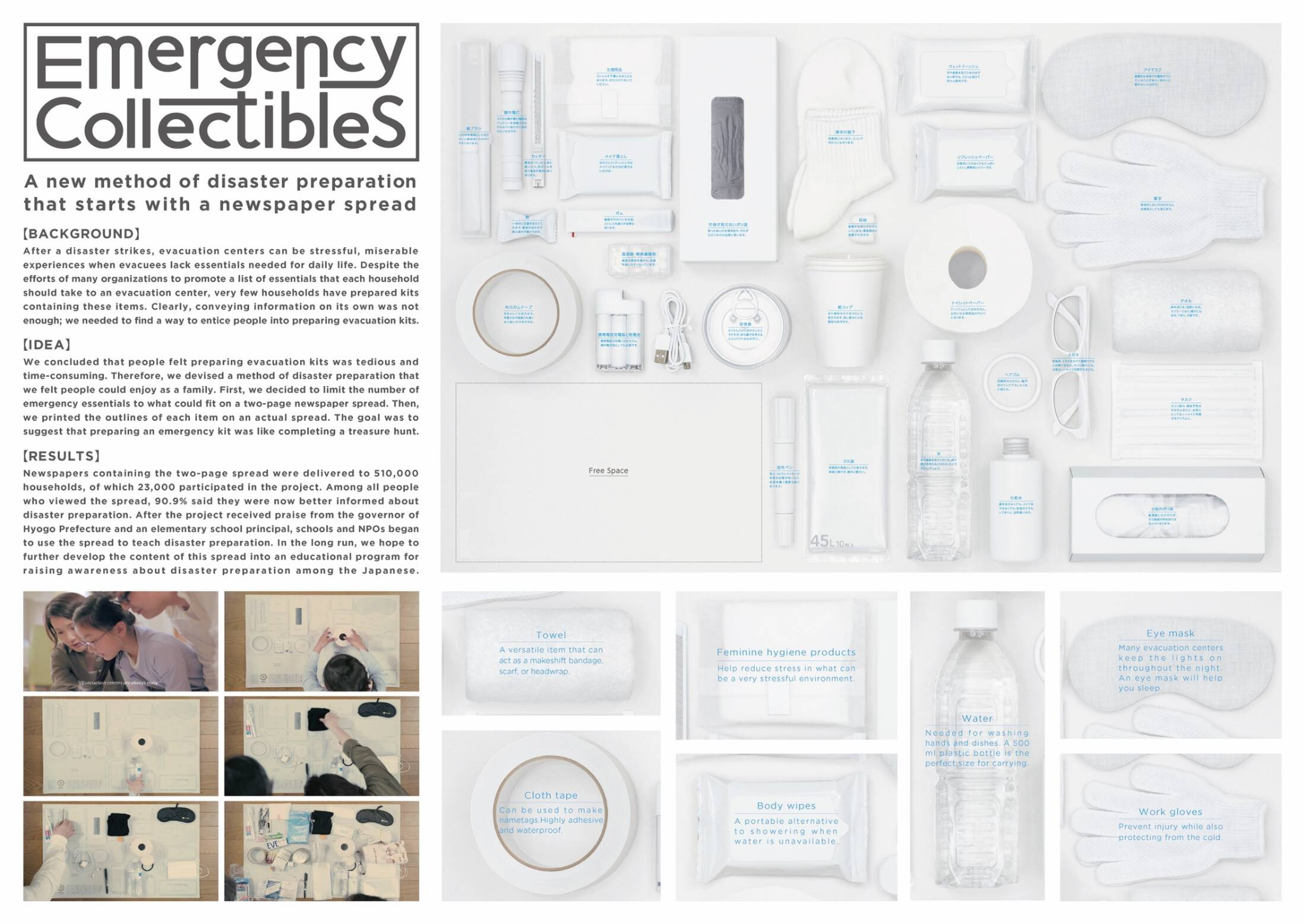
Visual Description: A large, predominately white poster. It features a photograph of twenty two white, life-sized items, neatly arranged so everything fits comfortably on the poster. Each item is labeled in blue Japanese text.
What Made It Work: This ad was created to help Japanese households assemble an emergency preparedness kit for events like earthquakes and typhoons. Each life sized item on the print can be covered with a real world counterpart. Once the page was completely full, your emergency kit was complete. The use of actual product images made it easy to identify each item at a glance, and the life-size layout gamified the kit-making process. This turned a stressful, oft-put-off chore into a family-friendly scavenger hunt.
Marketing Takeaway for Today’s Brands: The tangibility of print ads provides a unique opportunity to design something that has long-term utility as well as promotional value. Think bookmarks, checklists, quick reference guides, or measuring tapes. The utility of these items helps ensure users keep them handy. Meanwhile, your attractive, branded design guarantees they never forget who provided them with such a helpful tool in the first place.
Source: Ads of the World.
Give Blood (IBTS) - Thank You
Year: 2026
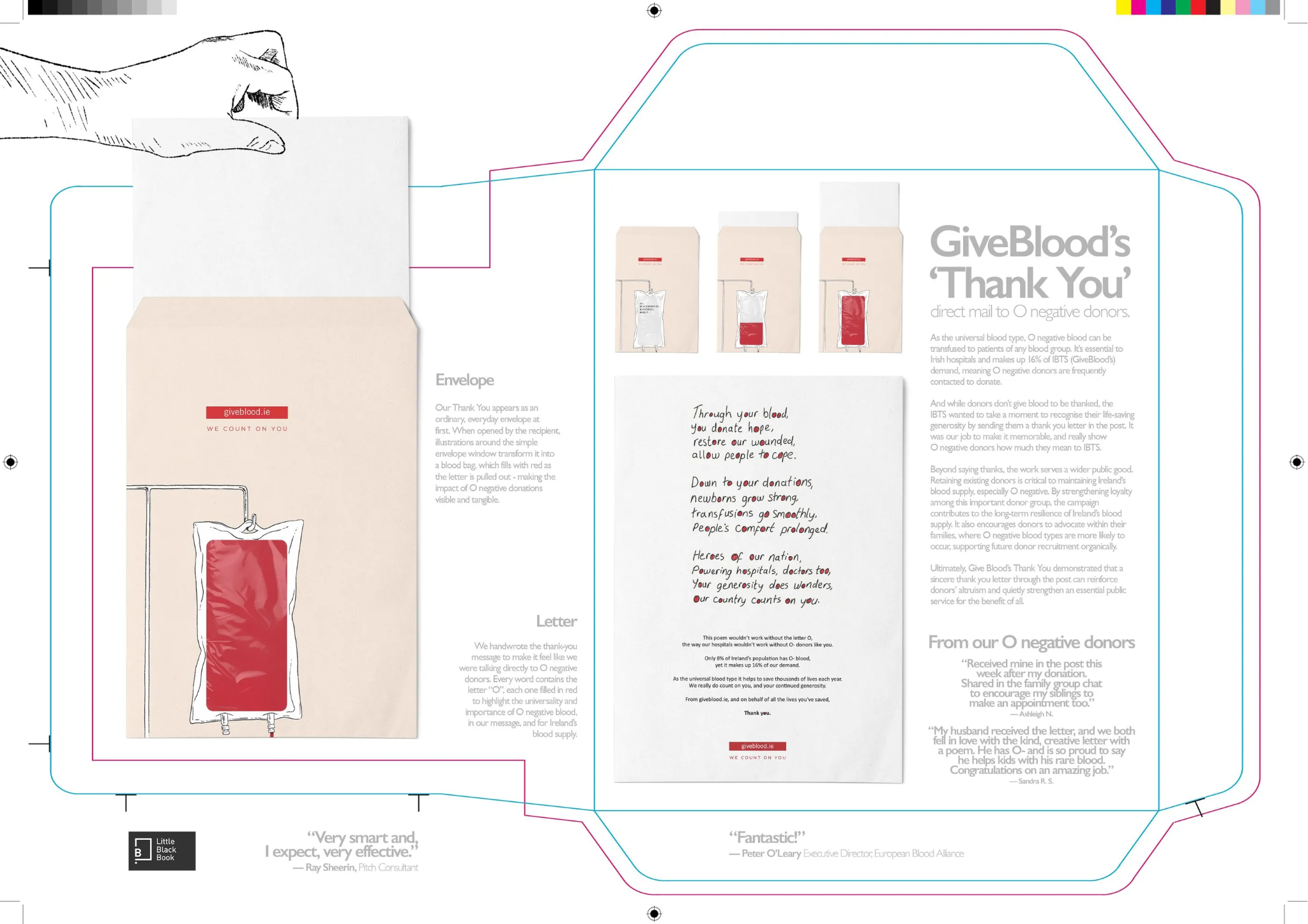
Visual Description: A vertically oriented envelope with a top seal and a clear plastic window in the shape of an empty blood donation bag on the back. As the donor thank you letter inside is pulled out, the blood bag appears to fill with red blood.
What Made It Work: O negative blood is relatively rare, which makes it especially important to keep established O negative donors returning to donate on a regular basis. Enter this eye-catching thank you note. Its compelling design and dynamic effect increased the perceived value and quality of the message, helping to warm recipients up to the idea of scheduling their next donation appointment.
Marketing Takeaway for Today’s Brands: It’s easy to dismiss interactive elements as just a gimmick. But when they’re done, they encourage your audience to linger. That extra time spent with your ad means improved long term recognition and recall of your brand. Better still, the added complexity that interactive elements give your prints can help your brand seem more legitimate, even high-end. Because thicker, more complex print products literally feel more valuable in a recipient’s hands.
Source: D&Ad.
Series: The Best Print Ads of All Time (Vol 2)
Looking for the original series? [View Volume 1 →]
Conclusion
Work that stands out across time and industries
Looking for more insights on print marketing and design? Check out the latest blogs from Wallace Carlson for expert tips, industry trends, and strategies to elevate your brand.