The Best Print Ads of All Time: Vol. 2 | Part 3
Memorable print ads from McDonald’s, Wonderbra, PlayStation, Apple, DHL and IKEA, and the creative ideas that made each campaign stand out.
Series: The Best Print Ads of All Time (Vol 2)
Looking for the original series? [View Volume 1 →]
McDonald’s - Monopoly
Year: 1987-2025
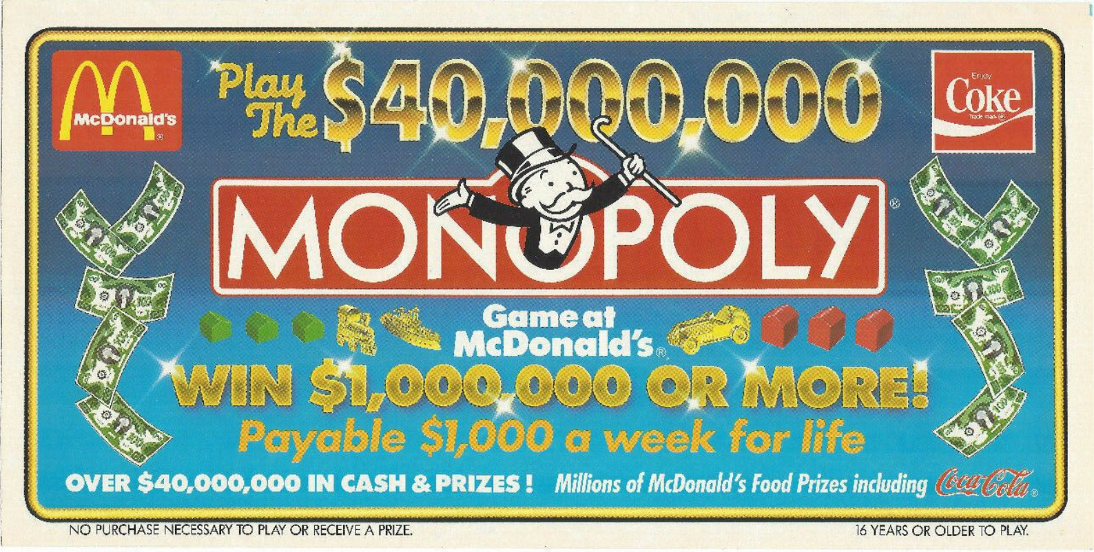
Visual Description: The horizontal cover of an original McDonald’s Monopoly gameboard. The text is alternatively gold and white on a blue gradient background. Dollar bills decorate the sides while illustrated green, red, and gold monopoly game pieces provide a break in the text. The red McDonald’s, Coca Cola, and Monopoly logos all feature prominently in the design.
What Made It Work: While the McDonald’s Monopoly game itself may now be somewhat infamous, as a print advertising campaign its success was undeniable. The all-encompassing event took over the brand’s cartons, drink cups, billboards, posters, mailers, etc. for weeks at a time. Perhaps the most brilliant element, though, was how the game required customers to hold onto their game pieces to win larger prizes. It turned each little coupon into a precious collectible, one that often lived on in wallets and pockets well after a given Monopoly run was concluded. So that, regardless of whether you win or lose, you’re never far from a reminder of your fun experience with all of the co-promoting brands.
Marketing Takeaway for Today’s Brands: While the promise of potential millions certainly helped the McDonalds Monopoly succeed, there have been plenty of other sweepstakes style promotions that never gained the same kind of traction. What makes this iteration special, and what other brands can take inspiration from, is how it managed to infiltrate the zeitgeist by stringing a series of beloved brands together in a cohesive, gamified print campaign. The physical act of peeling, collecting, and redeeming game pieces is what really kept McDonald’s and Monopoly perpetually in-mind for players, even after the game had played out.
Source: WorthPoint.
Wonderbra - “Hello Boys”
Year: 1994
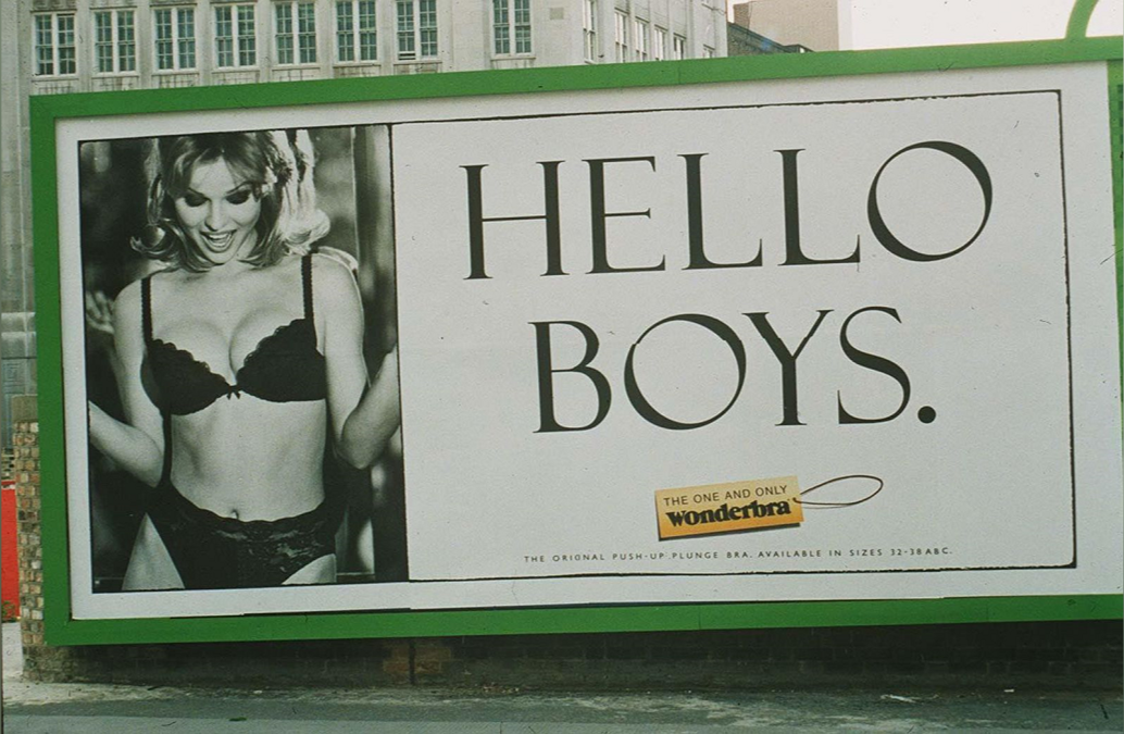
Visual Description: A mostly black and white billboard. On the left quarter of the ad there’s a photo of model Eva Herzigová wearing black lingerie, looking down playfully at her physique. In the remaining ¾ of the ad, the two words “HELLO BOYS.” occupies almost the entire space. Beneath that text, a small yellow tag on a string contains the brand name Wonderbra.
What Made It Work: Did you know that England was in the middle of a battle of the bras in 1994? Wonderbra was seriously at risk of being outcompeted by the similar Ultrabra, so marketers decided they needed to make a big, in-your-face type of ad. The type of ad that, love it or hate it, you couldn’t ignore. And this billboard did the trick. It shocked, sensationalized, and helped bring the Wonderbra into the shared consciousness of a whole new generation of consumers.
Marketing Takeaway for Today’s Brands: Fortunately, not all print ads need to be provocative to work. The core principals at play are simpler than that - attention grabbing design and unavoidable placement. While digital ads can seem more ‘unavoidable’ on account of our constant engagement with our phones, they’re easy to mute, dismiss, or scroll past in a fragment of a second. Physical print ads, especially posters and billboards, take far more time to move away from. Consequently, they also take far more time to fade from the conversation. Just don’t be afraid to push the design envelope to ensure that conversation gets started in the first place.
Source: CNN.
Sony Playstation - “VEINS”
Year: 2000
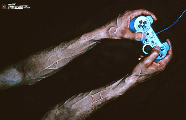
Visual Description: A photo of a pair of male arms. The arms are pale with dark hair and prominent veins. The hands are holding a Playstation 1 controller, and the background is solid black. The lighting is harsh, emphasizing the shapes of the play buttons that can be seen within the raised veins. A tiny tagline in the top left corner reads “Do not underestimate the power of playstation" next to the Playstation 1 logo.
What Made It Work: Early PlayStation ads generally leaned provocative. Many implicity compared the experience of gaming to hedonistic and less-than-legal thrills. It was edgy, it was modern, and it got people saying a lot, both good and bad. But the shocks proved more powerful than any blowback, and Playstation’s early print ads are now celebrated as some of the most iconic and creative of their time. They made what had previously been seen as a childish pastime adult, modern, cool - perhaps even dangerous in the wrong hands.
Marketing Takeaway for Today’s Brands: Print’s tangibility makes it profoundly effective for campaigns that are raw, gritty, or even shocking. As a physical medium, it makes ads feel even more in-your-face than they would be on a screen. The perfect solution for brands looking to push the envelope and get under peoples’ skin, so to speak.
Source: AdsSpot.
MacBook - “Ultra Thin”
Year: 2007
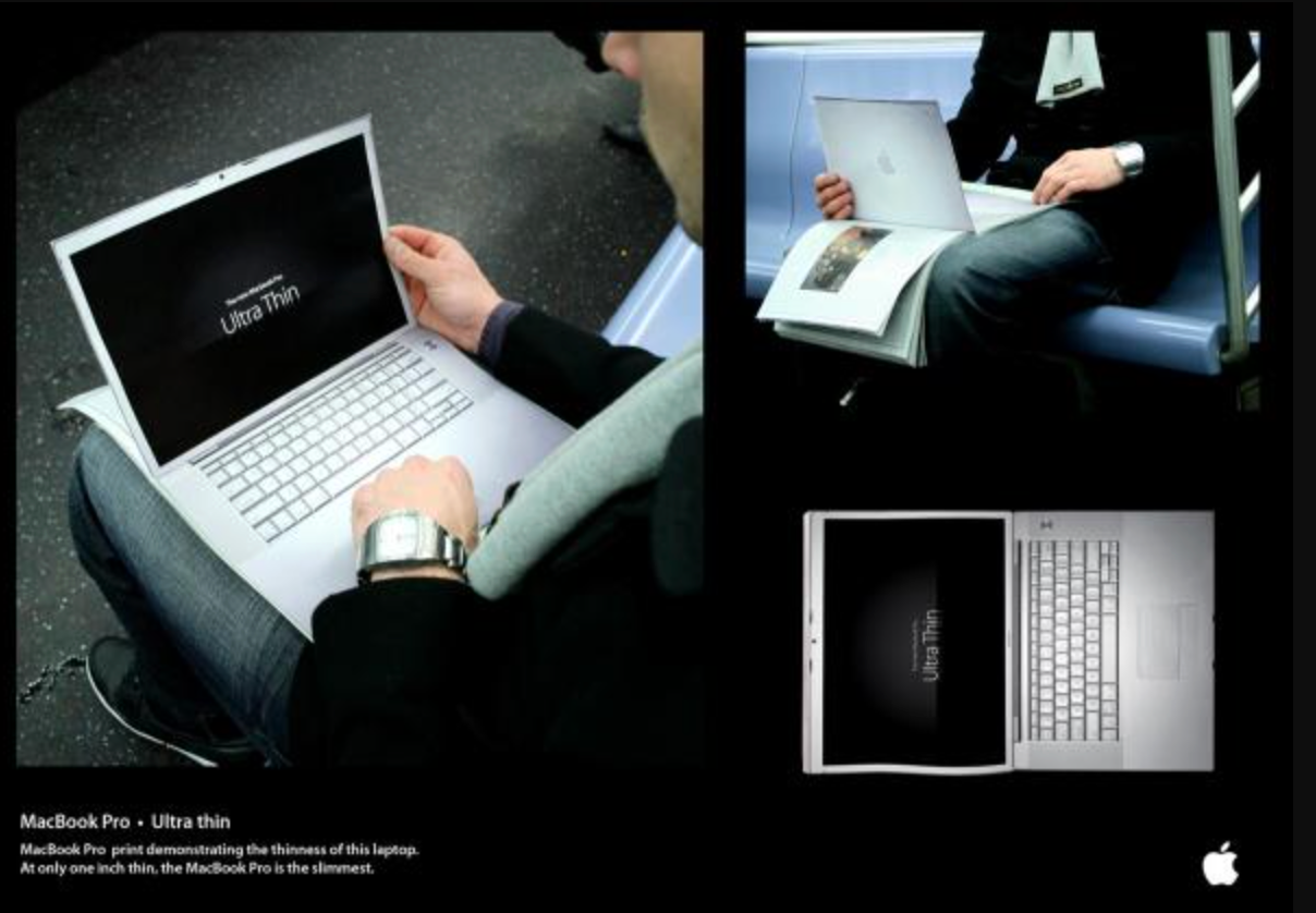
Visual Description: A three page magazine print ad. On the first page there’s a realistic depiction of the top outer case of a 2007 MacBook Pro. Then the reader flips that page to reveal a realistic depiction of the interior of that same MacBook. On the black screen of the laptop, white text reads “Ultra Thin”.
What Made It Work: It’s difficult to find information on this ad. In fact, it may even have been a student project, if its accreditation to the School of Visual Arts is accurate. But despite it now being something akin to lost media, we still think its highly effective design deserves a callout. It leverages the scant depth of a sheet of paper to allude to the impressively slim profile of the new MacBook Pro. It’s also a clever way to foster an extended interaction with the ad, encouraging users to practice flipping open a brand new, cutting edge laptop for themselves.
Marketing Takeaway for Today’s Brands: Similar to the Adidas “Forever Sport” campaign we highlighted in Volume 1 Part 1, this ad is a terrific example of how to encourage users to play with prints and, in doing so, to spend a little extra time building affinity for your brand.
Source: AdsSpot.
Jung von Matt - “DHL is Faster”
Year: 2014
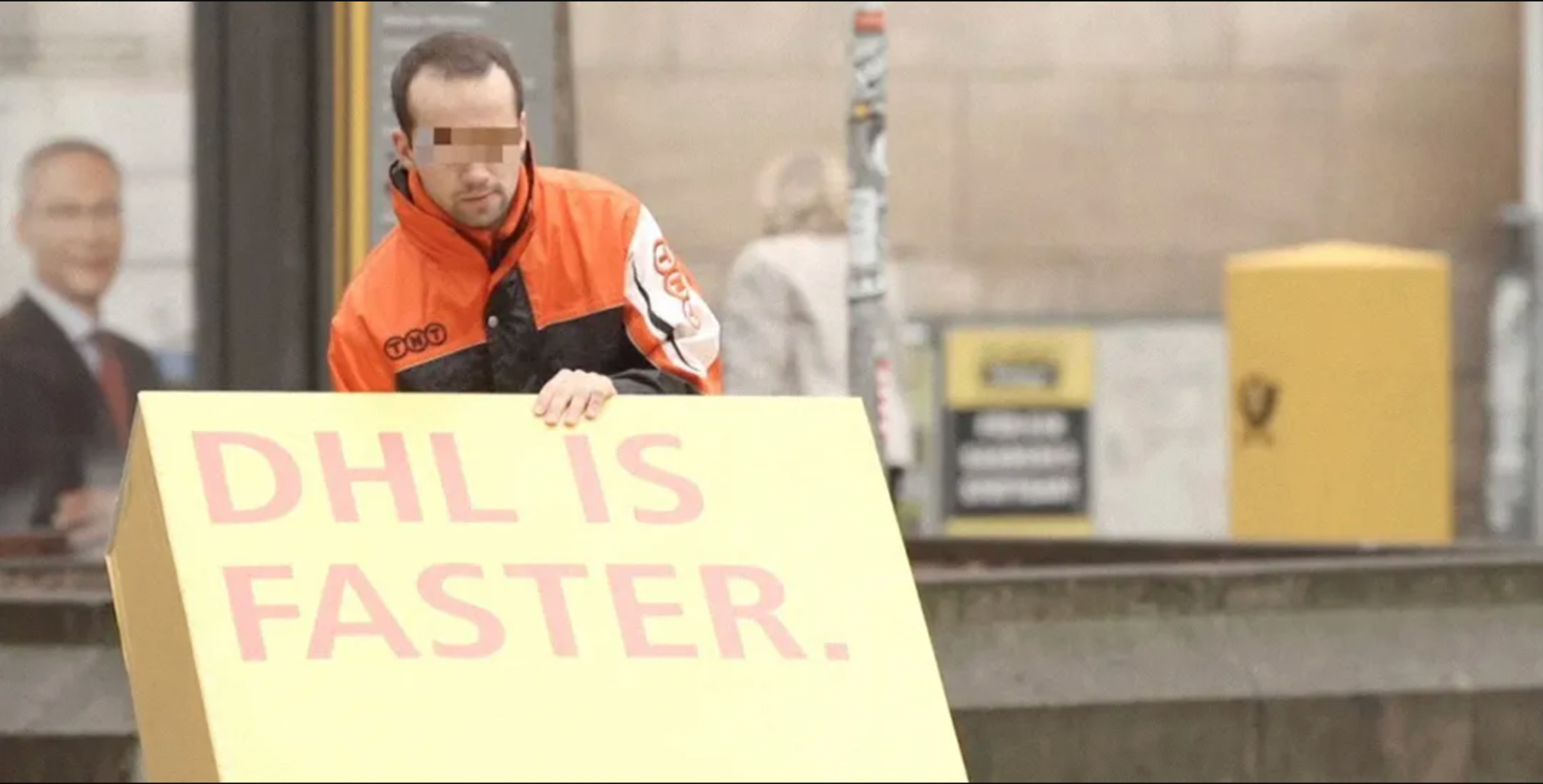
Visual Description: A large, cumbersome yellow shipping box. The words “DHL IS FASTER” are printed on it in red ink, completing DHL’s signature yellow and red color combination. A rival company’s delivery person is handling the box in an urban setting.
What Made It Work: Some say this was a gorilla marketing campaign. Others say it was a staged concept/pitch video that only accidentally got out. Whatever its origins, the final result was undeniably viral. Difficult to maneuver boxes were printed with the signature slogan, before a thermosensitive coating was cooled to the point where it changed color, masking the boxes’ true message before being handed off for final delivery to difficult destinations in busy areas. The result - a bunch of DHL competitors prominently proving the campaign’s message true, live on video.
Marketing Takeaway for Today’s Brands: While the format that most people consumed this ad in was video, the element that really made it work was print. Specifically, a printed box that made very clever use of specialty print finishes. These finishes can be used by any advertiser to create exciting, surprising, and attention grabbing effects and prints that get people talking.
Source: Selfstorming.
IKEA - “Pee Ad”
Year: 2018
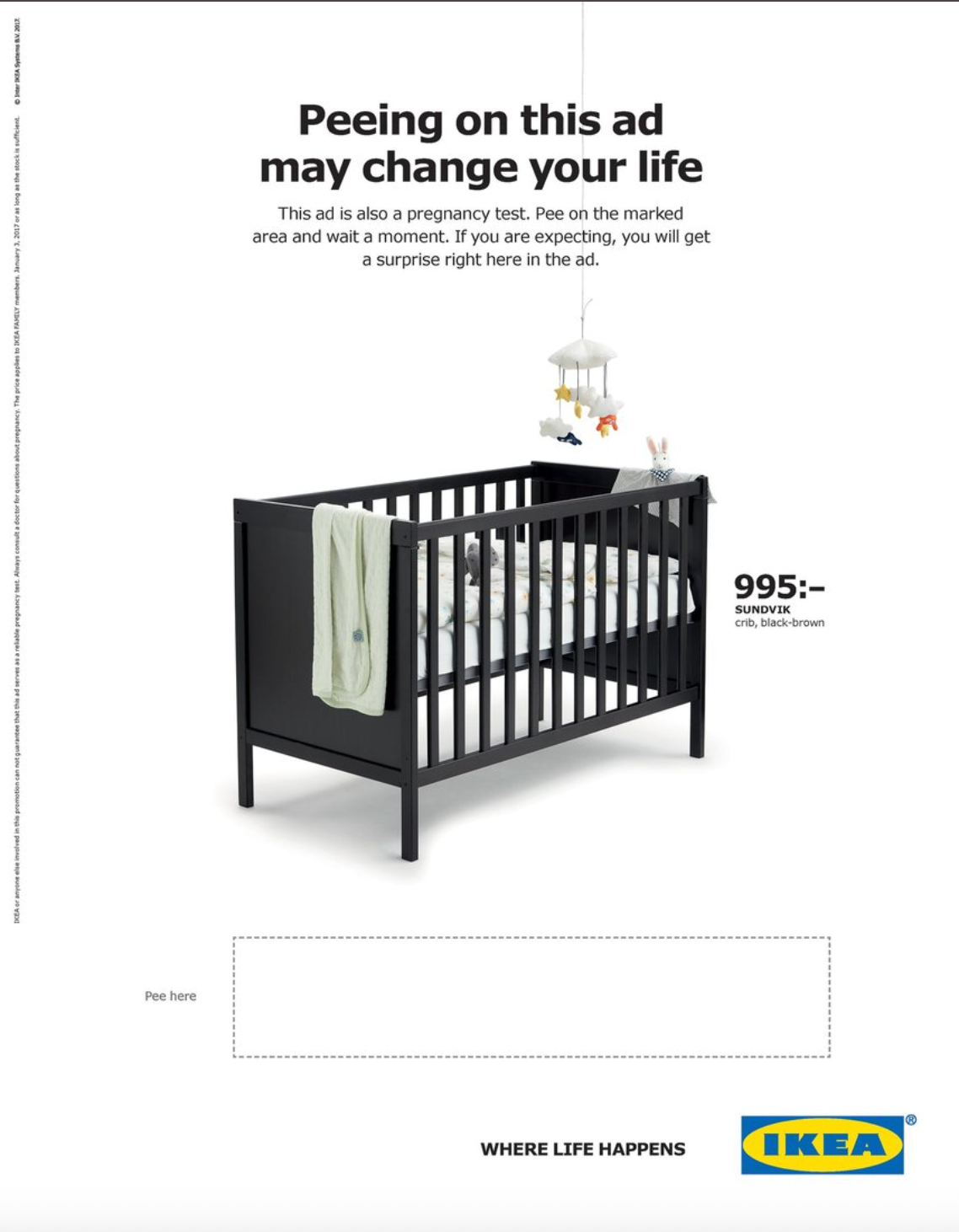
Visual Description: An image of a black infant’s crib decorated with a few blankets and toys, set against a white background. Beneath the crib is a blank white box with the text “pee here” to the left. Black text at the top of the image explains that the box below is a pregnancy test, and it will reveal a coupon code for a discounted IKEA crib.
What Made It Work: Once again, shock value proves it’s worth in the world of advertising. But while the concept of this ad may make some viewers squeamish, its sentimental messaging helped it to find the optimal balance between crass and cute.
Marketing Takeaway for Today’s Brands: A print ad can embrace physical interactions in a way digital simply can’t. With specialty inks, finishes, papers, and treatments, consumers can be drawn into extended and complex interactions. That’s great for getting people talking, and for getting folks to remember your brand in the future.
Source: AdWeek.
Series: The Best Print Ads of All Time (Vol 2)
Looking for the original series? [View Volume 1 →]
Conclusion
Work that stands out across time and industries
Looking for more insights on print marketing and design? Check out the latest blogs from Wallace Carlson for expert tips, industry trends, and strategies to elevate your brand.