The Best Print Ads of All Time: Vol. 2 | Part 2
Iconic print advertising from Sears, Coca-Cola, Guinness, Pan Am and more, and the creative ideas that gave these campaigns lasting impact.
Series: The Best Print Ads of All Time (Vol 2)
Looking for the original series? [View Volume 1 →]
Sears Roebuck - Catalogs
Year: 1894-1993
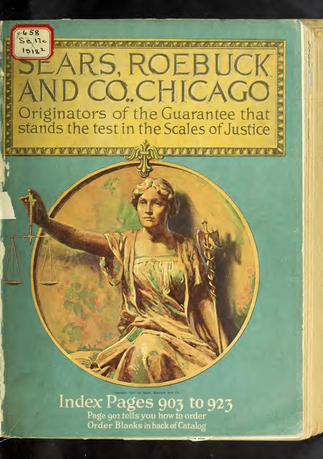
Visual Description: A visibly aged catalog cover featuring an illustration of Lady Justice, seated and framed within a gold medallion. She is holding a set of scales in her outstretched right hand that extend past the edge of the medallion. The background is teal. A gold box at the top of the cover reads “Sears, Roebuck and Co., Chicago Originators of the Guarantee that stands the test in the Scales of Justice”. Additional white copy sits below the medallion.
What Made It Work: The Sears Roebuck catalog was one of the most successful direct mail advertising campaigns ever. While other companies had created catalogs before them, Sears Roebuck’s publications were infinitely more comprehensive and beautifully illustrated, featuring page after page of detailed imagery and descriptions. At the turn of the 20th century, Sears turned catalogs into something exciting, entertaining, and so useful folks never wanted to throw them out.
Marketing Takeaway for Today’s Brands: Today, the internet lets us look up anything we want, any time we want. And yet, high quality print catalogs continue to improve sales and grow audiences for the companies that produce them. The fact is that an attractive catalog, full of detailed professional imagery, remains an object of entertainment and high perceived value. They invite potential customers to peruse, pause, and hold on to them for weeks, months, or even years. That kind of staying power is something digital simply cannot match.
Source: The Internet Archive.
Coca Cola - Santa
Year: 1931
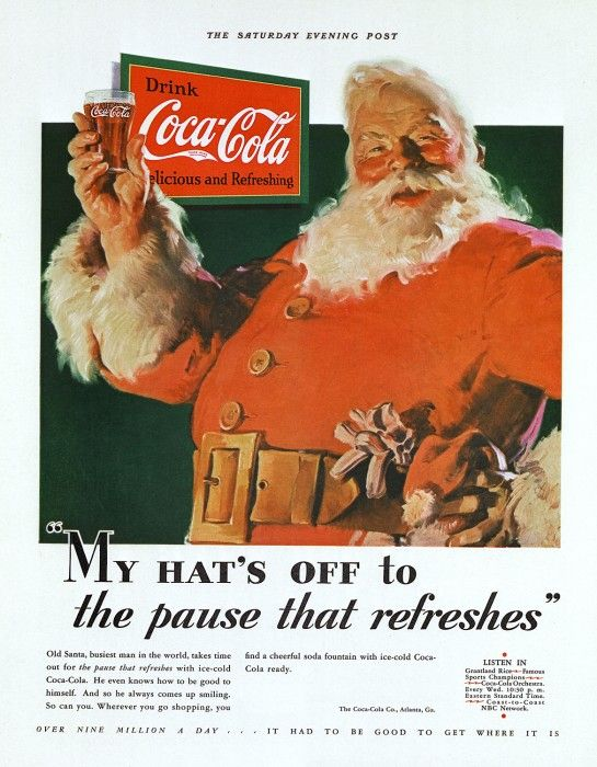
Visual Description: An illustration of Santa, depicting him as a cheerful, portly man with a long white beard and a bright red suit. He’s holding up a glass of Coca-Cola in his right hand and facing the viewer, his hat held in his left hand as he braces it on his hip. The slogan beneath the image reads “My Hat’s Off to the pause that refreshes” while the Coca Cola logo hands prominently in the negative space between Santa and his outstretched hand. The illustration background is dark freen, while the border and the background for the black text at the bottom of the ad is white.
What Made It Work: Coca Cola commissioned Haddon Sundblom to create an endearing, lovable vision of Santa Claus that just so happened to fully endorse their drink. The resulting ad was so aesthetically pleasing and endearing, it’s become a prized piece of collectible art framed in peoples’ homes. To this day, Coca-Cola remains an iconic brand associated with Christmas time, thanks largely to the lovable nostalgia imbued in this ad.
Marketing Takeaway for Today’s Brands: One way to optimize print’s physicality is to literally make it desirable as artwork. Something so appealing that recipients want to save it, like a collectible. The key to pulling this off is to create a design that connects authentically with your audience. Take the time to understand and capture not just their aesthetic preferences, but also their mood, their passions, and their nostalgias.
Source: Coca Cola.
Guinness - “My Goodness My Guinness”
Year: 1939
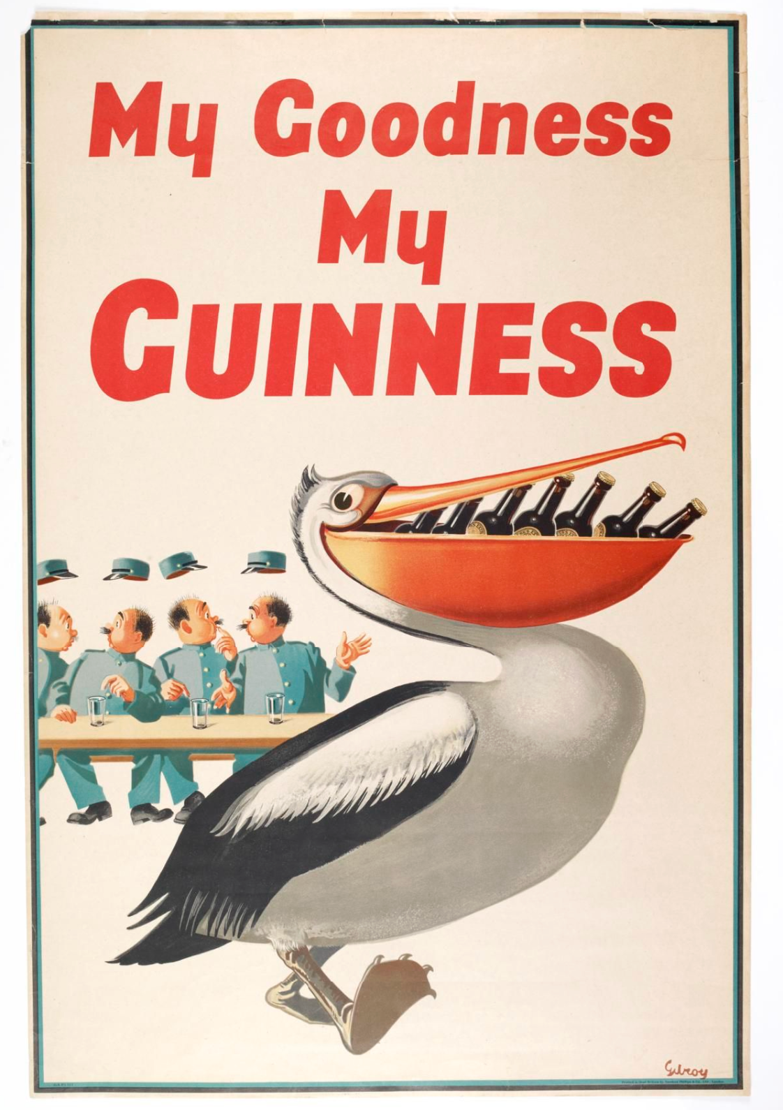
Visual Description: A large pelican is centered in the foreground. It’s facing right with a beak filled with bottles of Guinness. In the background on the left, four zookeepers are seated at a table, so shocked that their uniform hats have flown off their heads. Above the image, in bright red letters against a white background, the tagline reads “My Goodness My Guinness”.
What Made It Work: Imagine developing a series of print ads so good, they become part of a national identity. My Goodness My Guinness posters, of which this was the first in a series, feature a menagerie of appealing animals running away with their keepers’ drinks. The concept on its own is simple, almost a little childish for a brewery. But the quality of the imagery and confidence in the design have elevated these ads to collectible status, and helped cement Guinness as Ireland’s national beverage for almost 90 years.
Marketing Takeaway for Today’s Brands: Here’s another excellent example of how investing in quality artwork can turn your advertising poster from a rudimentary piece of marketing collateral into a coveted collectible. Investing in a great design and more durable materials could mean your ad lives on for years, decorating the walls of the businesses you sell to, and reinforcing your brand’s authority every single time someone glances up.
Source: Guinness Archive.
Pan Am - 747 Poster
Year: 1969
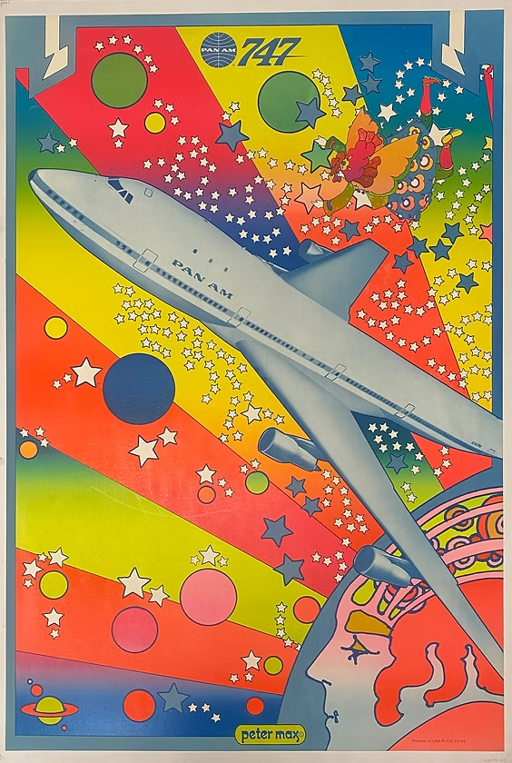
Visual Description: A cartoon multi-colored face in profile occupies the bottom right corner of this poster vertically oriented poster. A rainbow array of eight, neon- colored beams emanate away from the face to cover the rest of the background. Atop the beams’ vibrant gradients of yellow, green, blue, pink, orange, and purple, there’s a smattering of solid white, blue, orange, green, and pink five-pointed stars and 15 small, colorful planets. Through the stellar bodies flies a photo of a Pan Am 747 rendered in blue half tones. It crosses diagonally across nearly the entire design, tilting up and to the left. A small character in colorful clothing looks on from the top right corner. There’s no title or tagline, just a small logo for Pan Am and the numbers 747 in the center top of the poster, while the artist’s name Peter Max is in small print in the center bottom.
What Made It Work: This poster has become so beloved, people will pay thousands just to own an original print of it. But at the time, Pan Am risked alienating older, more established customers due to psychedelic art’s place in the counterculture. But in the end, the brilliant print quality and signature style of famed artist Peter Max came together to create a piece of advertising history that has now even outlived the airline it advertised for.
Marketing Takeaway for Today’s Brands: Print remains the most powerful way to make a lasting, physical impression on pop culture. And bright, vivid print quality is a great way to do it. Today it’s far easier than it was in 1969 to achieve highly saturated color, and modern finished like holographic foil produce effects that Pan Am could scarcely have dreamed of. Put it all together and you can create designs that are so high quality, people know instinctively that they’re holding something truly valuable and made by a brand that embraces innovation.
Source: The Pan Am Poster Archive.
Pattex - Crossword Puzzle
Year: 2010
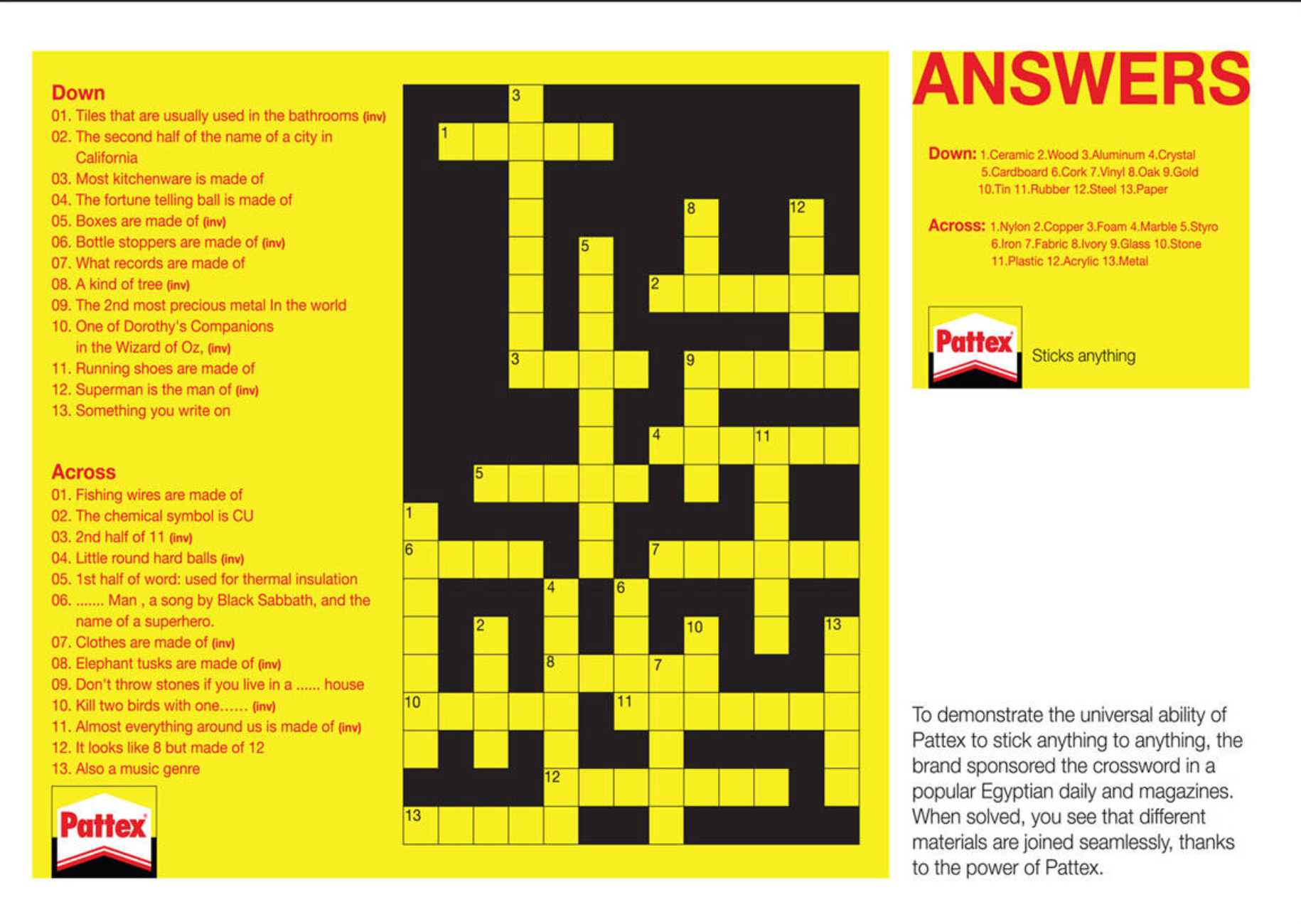
Visual Description: A crossword puzzle printed in black on a Pattex yellow background. The clues are printed in red on the left third of the ad. A small Pattex brand logo is situated in the bottom left corner.
What Made It Work: The idea of using puzzle imagery in a print ad isn’t strictly new. What is unusual, though, is that this is an actual puzzle. Often, when puzzles are depicted, they’re either not actually playable or so simple that they only take a second or two to solve. Creating a real game helped Pattex provide a high-value experience for folks who appreciate a good solve, while their brand’s signature yellow in the background ensured every moment spent playing was also a moment spent building brand recognition. And in the end, the answers reveal a clever message about their product - with Pattex, you really can stick just about anything to anything.
Marketing Takeaway for Today’s Brands: It’s a mistake to think the main goal of an ad is only to sell something. That’s a goal, but arguably an even bigger goal is to get viewers to spend more time interacting with your brand. So that the next time they need your product or service, you’re the default answer. You’re the brand that’s synonymous with quality and positive experiences. And creating a print ad that provides a free few minutes of offline fun, no strings attached, is an exceptional way to achieve that goal.
Source: Ads of the World.
Burger King - Paper Crowns
Year: 2010
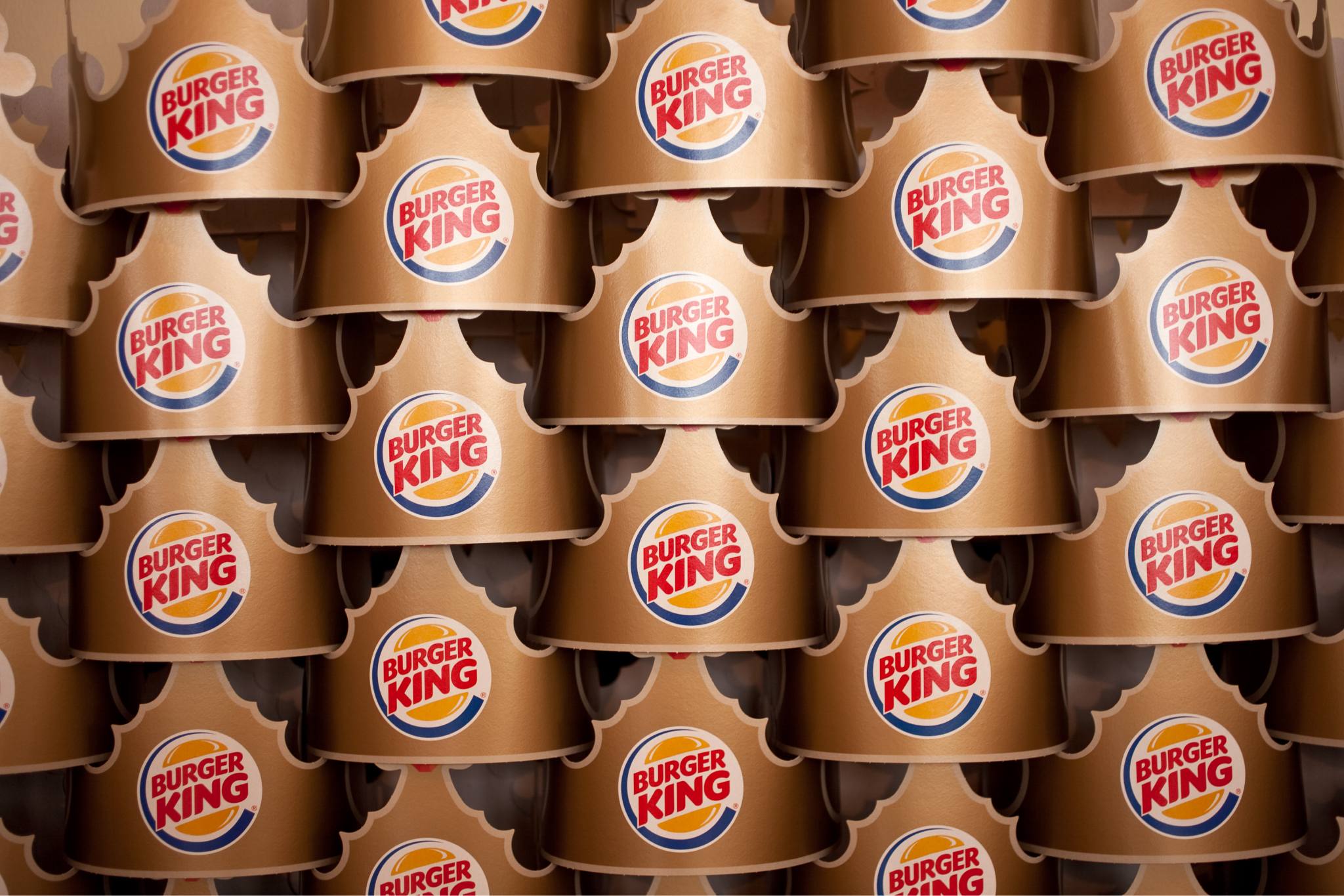
Visual Description: A gold-colored paper crown with four crosses rising up at even intervals, each illustrated with a colorful gem. The circular Burger King logo is featured prominently beneath the front cross.
What Made It Work: Uncovering the exact history of these crowns is a challenge. Facts like when they first showed up and who first proposed them are obscured by time. But their impact is crystal clear. The Burger King crowns have become one of the most effective leave behinds/free giveaways ever implemented. Their charmingly simple design, direct appeal to young customers in particular, and wide distribution across the entire franchise have led to infinite free advertising over the decades, as satisfied customers proudly walk around with their favorite burger brand right on their heads.
Marketing Takeaway for Today’s Brands: Print mailers, leave behinds, and giveaways often lean towards the informative and practical. But they can also be purely fun. Paper hats, paper fans, flipbooks, playing and trading cards, and stickers with simple branding and strong, appealing designs can all be long-term passive advertising in the hands of happy customers.
Source: Wikimedia Commons.
Series: The Best Print Ads of All Time (Vol 2)
Looking for the original series? [View Volume 1 →]
Conclusion
Work that stands out across time and industries
Looking for more insights on print marketing and design? Check out the latest blogs from Wallace Carlson for expert tips, industry trends, and strategies to elevate your brand.