The Psychology of Print Advertising
Texture, weight, and color all influence how consumers feel about your brand. See how print finishes and materials shape emotional response and perceived value.

How Texture, Color, and Finish Influence Consumer Response
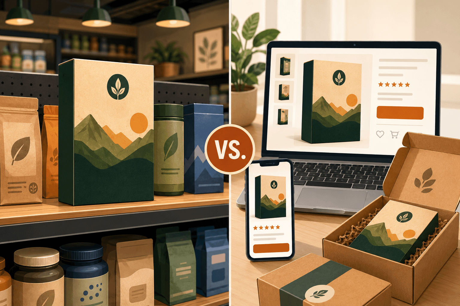
There are lots of reasons why print still stands out, even in a digital-first world. It’s familiar. It connects with audiences that digital formats struggle to reach. And above all, it's an experience. As a physical medium, print provides mutli-sensory pathways for building emotional connections with consumers. But to seize this advantage, it’s necessary to consider each physical characteristic of a print in turn; its color, texture, finishes and materials. So in this blog, we’ll be walking you through how to do just that.
How Print Engages the Brain
Humans form first impressions fast, often in a matter of seconds. To do so, our brains use every sense at their disposal to quickly consolidate information. With digital ads, the only senses we have to go off of are sight and, sometimes, sound. But print offers more. Texture, weight, and even smell can all help engage the brain more robustly, triggering a sense of ownership and tapping into a variety of strong emotions.
Texture, Finish, and Tactile Influence
Several elements contribute to how a print feels, physically. What you choose for each of these elements will impact how a consumer feels about not just your print, but also the products and brand it promotes. First, there’s the relative weight and texture of the substrate. For example, a smooth, heavy cardstock is great for communicating a sense of reliability, quality, and durability, while a lightweight, linen-texture paper reads as more soft, natural, and refined.
Next, there are the coatings applied over the top of the print. A variety of matte, satin, gloss, and velvety (soft-touch) coatings are available, and they can be applied either to the entire print or just select details. Across the board, coatings tend to elevate the perceived value of the print in hand. But using certain coatings in certain ways can also help target more specific emotions. For example, a print with an all-over soft-touch coating may evoke a sense of luxury, while a print with raised, super glossy letters will feel more bold and exciting.
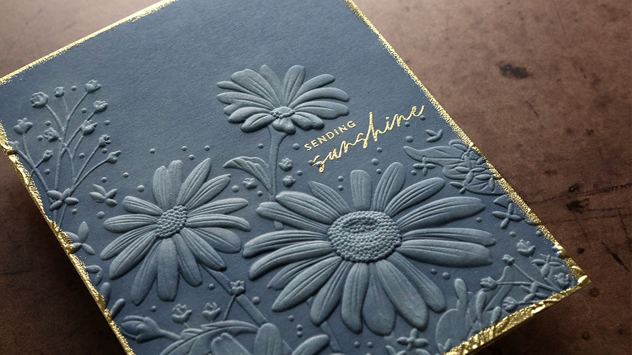
Finally, there are finishes that impart additional texture, such as embossment and foil. Depending on how you employ these finishes, they can help you target just about any kind of emotion. Layer sleek gold foil over an embossed logo, for example, and you’ve got an instant recipe for luxury and exclusivity.
Color Psychology and Visual Perception

Of course, the visuals of a print are also incredibly important for influencing customer response, especially the colors you use. Color theory suggests that different colors trigger different emotions in the viewer, and that colors may look different depending on where and how they’re used. For example, red is generally an effective color to communicate urgency, especially to a North American audience. However, if you pair red up with white and blue, you may end up communicating something about American patriotism, whether you mean to or not.
To get the desired effect from your print color choices, keep Context and Consistency front of mind. Context means being aware of how your specific audience might interpret your color choices and planning your designs accordingly. It also means considering how your colors will look where they’re being displayed or distributed. And consistency means using the same precise colors throughout a given campaign or across your entire brand. This way, you can be sure your prints communicate the right message, both overtly and subliminally, while building long term brand awareness.
Creating Cohesive, Trust-Building Print Experiences
When all of your print elements work together harmoniously, you can build powerful connections with consumers in a matter of seconds. The physical weight and presence of a beautifully printed piece of collateral fosters trust and confidence, both consciously and subconsciously, with your brand. And working with an expert, well-resourced printer is the best way to ensure your prints hit that high mark, every time. An expert like Wallace Carlson, invested in innovation and exceptional service, who knows how to translate the nuances of your brand into texture, color, and design.
Reach out today to experience the Wallace Carlson difference for yourself.
Conclusion
Work that stands out across time and industries
Looking for more insights on print marketing and design? Check out the latest blogs from Wallace Carlson for expert tips, industry trends, and strategies to elevate your brand.