Common Prepress Mistakes and How to Avoid Them
Avoid costly reprints by catching these common prepress mistakes before you send your files to print—plus expert advice from Wallace Carlson.
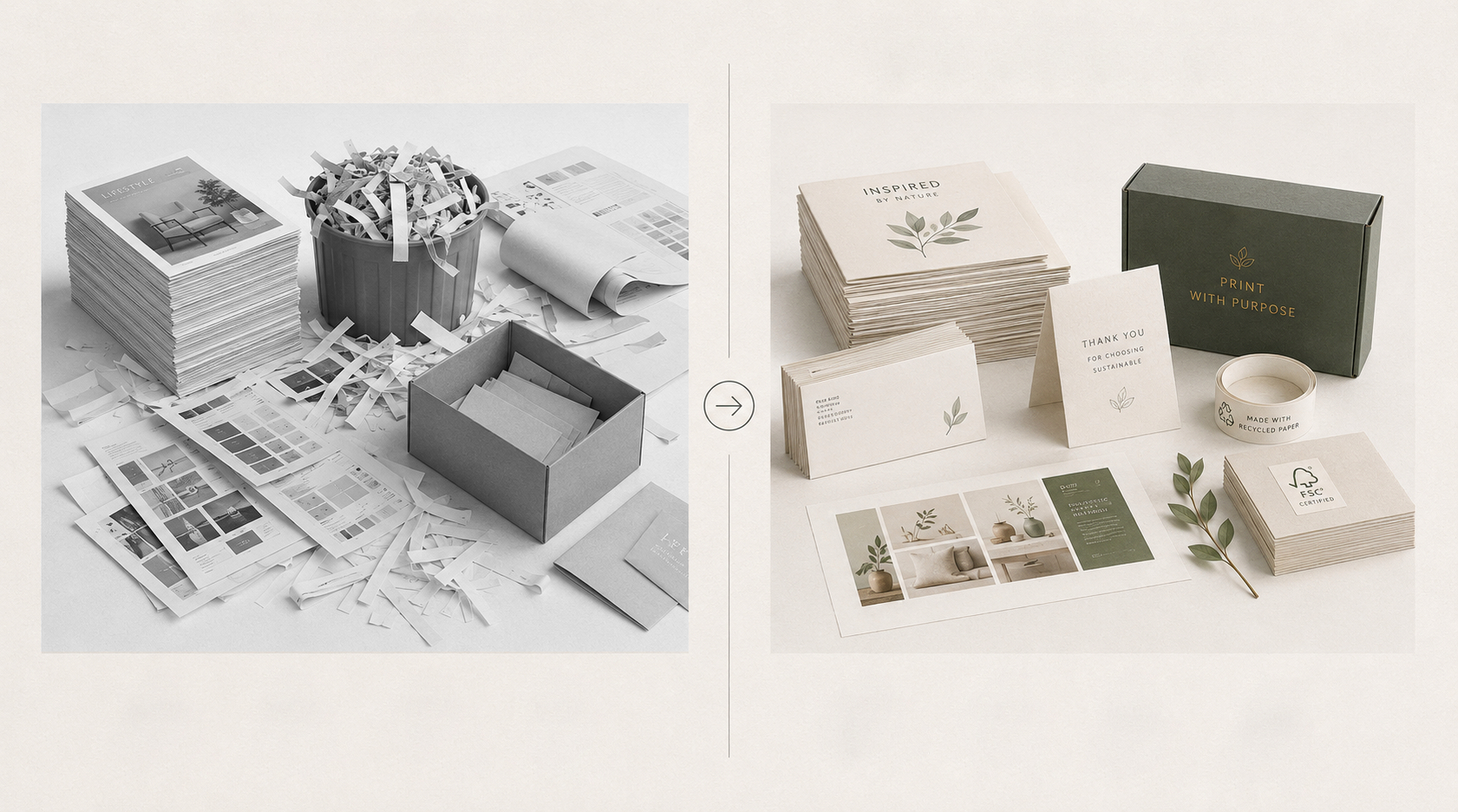
We’ve talked about common mistakes folks make during the print design process before. Now, it’s time to dig into the ways that prepress tends to trip people up. In simplest terms, the prepress process refers to all the work that happens between the initial design phase and the commencement of the physical print run. It’s where the design gets finalized, and the necessary resources for printing are created and collected. It’s also a phase where small errors, if missed, can lead to big consequences, including missed deadlines and wasted resources. Luckily, most common mistakes can be avoided with just a little extra attention and knowledge about the process.
Top Prepress Mistakes Printers See Most Often
Let's start by looking at five of the most common mistakes we see when files are sent in for printing.
1. Low-res Images
Most printers require an image resolution of at least 300 DPI (Dots per Inch). Anything lower than this can cause blurriness in the final product. Also, ensure you’re looking at DPI and not PPI (Pixels per Inch) when you’re checking the resolution. PPI refers to the on-screen resolution of an image and isn’t equivalent to DPI.
2. Missing Bleed or Trim Lines
When designing a document for print, many people’s first instinct is to design it just as they want it to look, from page edge to page edge. However, if your design includes print information that’s meant to extend to the very edge of the page, then your design really needs to extend past that final edge. This extension past the edge is called the bleed, and most printers require it to be a minimum of .125 inches. Common examples of design elements that require bleed include color blocks, full-page imagery, and patterned or colorful backgrounds.
3. RGB Color Mode Instead of CMYK
Digital files often default to an RGB color mode. However, printed files need to be formatted in CMYK or PMS color mode. CMYK stands for Cyan, Magenta, Yellow, and Black, which are the four ink colors that, when combined in layers of tiny dots, create full-color images. PMS stands for Pantone Matching System, and is the correct color mode for prints that are designed specifically using PMS colors.
4. Unembedded or Non-Outlined Fonts
In vector files, such as those with a .PDF extension, extra steps are required to guarantee all fonts make their way to the printer and, ultimately, show up on the page as intended. Fonts that have not been either embedded in the file or converted to vector graphics via outlining can be misread by other devices and reinterpreted as different fonts or characters.
5. Spelling and Layout Errors
Finally, the typos. Even meticulously formatted files sometimes get sent in with spelling mistakes, inconsistent text formatting, insufficient margins and gutters, and even incorrect or mixed-up illustrations. In many ways, these mistakes are the hardest for your print partner to spot on your behalf, since printers don’t always know the specifics of how your institution spells its proprietary terms or how you prefer to balance your design content. This makes it especially important that you conduct careful in-house proofing of your content before passing it off to your commercial printer.
How to Prevent Print Errors From the Start
Now for some very good news - just reading content like this and becoming aware of common mistakes will help you prevent such errors during your next print project. Other steps you can take to keep costly misprints and time delays at bay include:
- Using a prepress checklist to ensure everything’s been systematically reviewed and approved. You can build your own, or work from an established prepress checklist like the one we’ve put together here.
- Using pre-flighting tools to check for print viability. Typically, these tools are built into your design software, like Adobe Illustrator or InDesign.
- Getting a second set of eyes to check your design content. Getting one or more people to check your work is particularly useful for catching typos and content errors that are harder for your print partner to identify.
When in Doubt, Ask Wallace Carlson
As your print partner, we’re always happy to help address all of your questions and concerns. It’s part of our constant commitment to providing Michelin Star-quality service. To get the conversation started, simply reach out to our experts today!
Conclusion
Work that stands out across time and industries
Looking for more insights on print marketing and design? Check out the latest blogs from Wallace Carlson for expert tips, industry trends, and strategies to elevate your brand.